
![]()
In this post we will take a look at changing axis text on graphs between English and French (or in fact any other languages you want). You should use the pbix we created in the previous posts to work from. This is probably the trickiest thing to dynamically change and requires a few leaps of logic. If a follow up post I will show you something much easier, dynamically changing titles (or any other text) on your visualizations.
In this example we are going to change the name of the month (January will change to janvier etc). To do this however we are going to have to double the size of our data set! We are going to have to “unpivot” the data so we can distinguish between English and French. This will become clear as you work through the post BUT for those of you working with large datasets this may be a challenge so consider the benefits before you do it.
Getting started
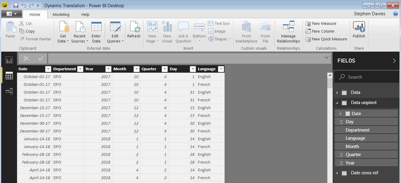
Ok so we are going to work from the previous pbix so if you have not worked through the previous posts then do so before starting this one. You will see that in that pbix we have 2 tables: “Data” and “Date cross ref” – we will need both of these to work through this example.
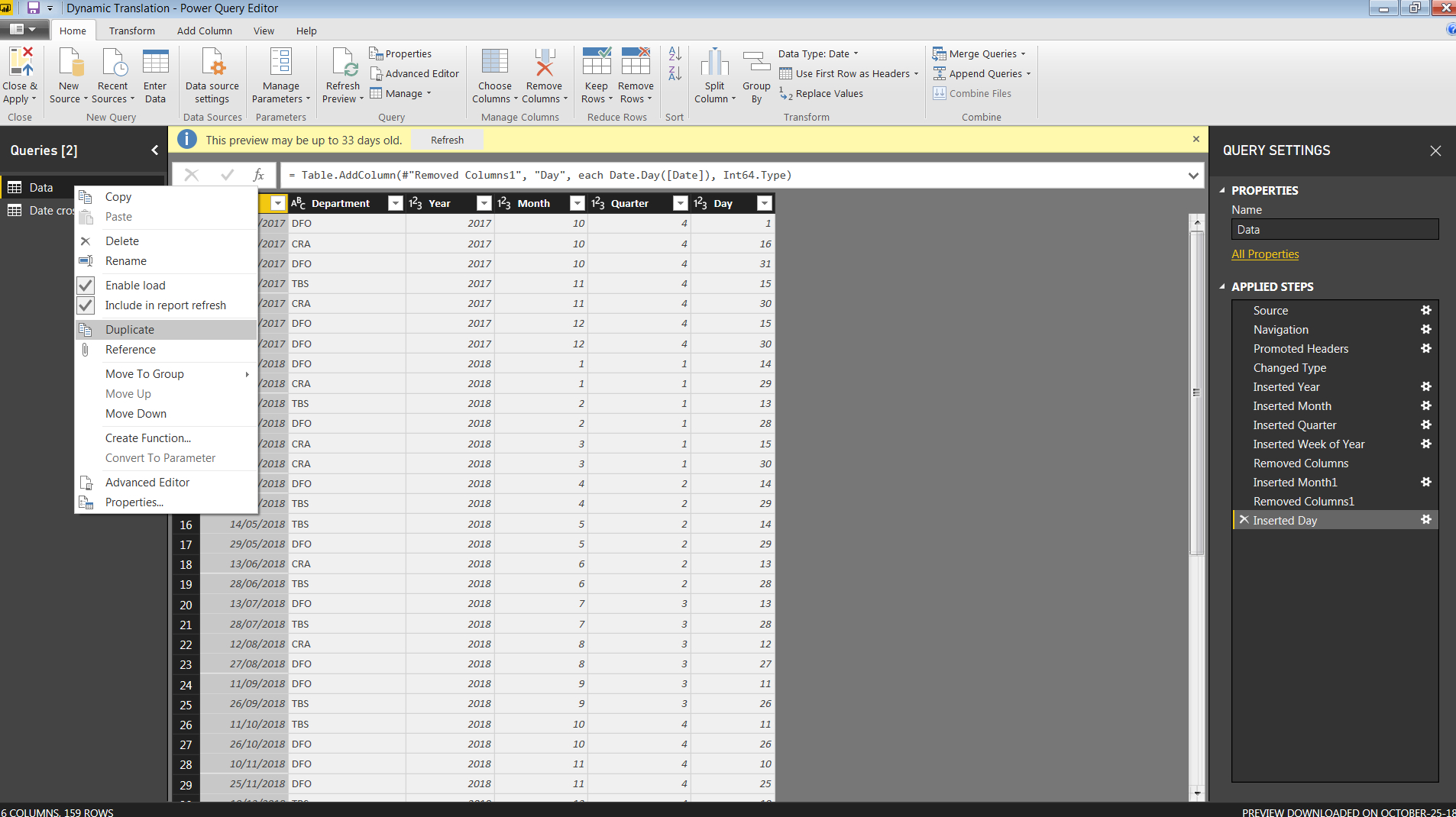
The first thing we have to do is to label the “Data” rows with a Language. I am actually going to duplicate the table to do this, but you don’t have to. So open up the query editor, right click on the Data tab on the left and then click on “Duplicate”. Look at the picture below to see how to do it:
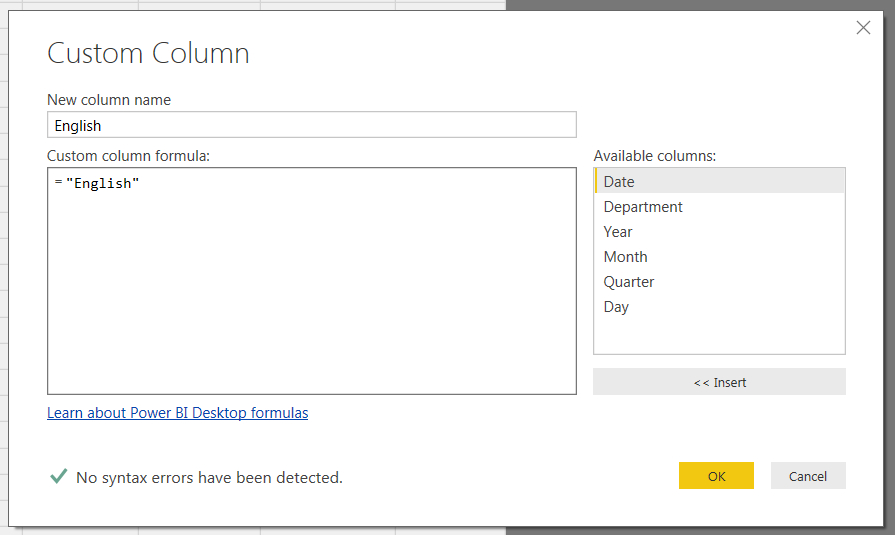
Once you have done that then rename the table “Data unpivot”. We now are going to add 2 columns. To do this click on “Add Column” on the top ribbon, then click on “Custom Column” and you should see an interaction box. It doesn’t matter what we are going to call the column but for clarity we will call it “English”. To do that change the name from “Custom” to “English” and then paste the following formula into the “Custom column formula:” field (note that you don’t need to type in the “=” sign):
"English"
It should look like the following, if it does then hit “ok”:
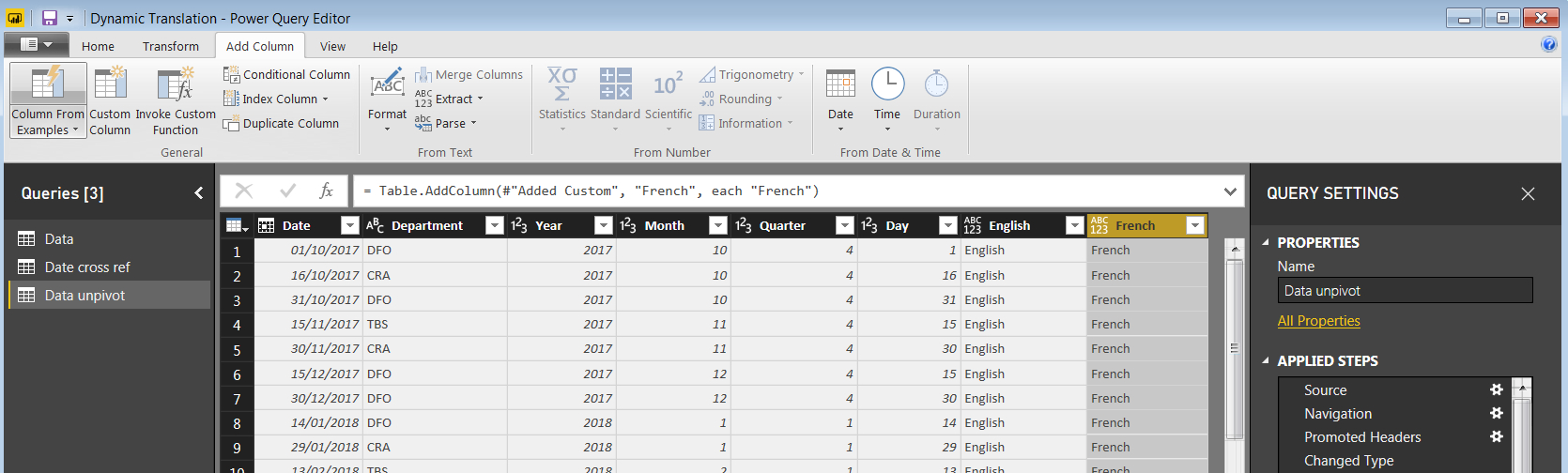
Repeat the above to add a “French” column, you should then see the following:
Why are we doing this? Well we want to create a set of alternating rows, for each data point one row labeled “English” and one row labeled “French”. This will allow us to add a chart plus a slicer to easily change between the two languages. In fact there are other strategies to achieve the same outcome where we create a separate table and link then with a common axis table but for now this is the simpler, if possibly less computationally efficient approach so will stick with it for now.
To achieve this we have to “Unpivot” our data. To do this shift + left click on the “English” and “French” columns to select them both (make sure nothing else is selected) and then click in the top ribbon “Transform” then “Unpivot Columns”. You will then see the following (note that the column headings will have changed value and the size of your dataset will have doubled.
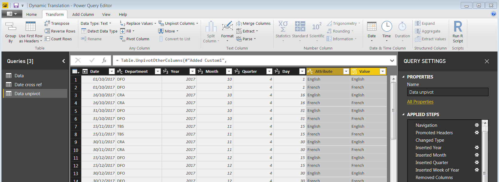
We now have to do two final things before we close and apply the query. We delete the Attribute column (we don’t need it anymore) and rename the “Value” column as “Language”. I am not going to screen capture that but if you have a problem leave a comment for me. Once you have done that Power BI will automatically detect the relationship with the “Date cross ref” table. The new imported table will look like this:
Adding in Calculated Columns to label the data
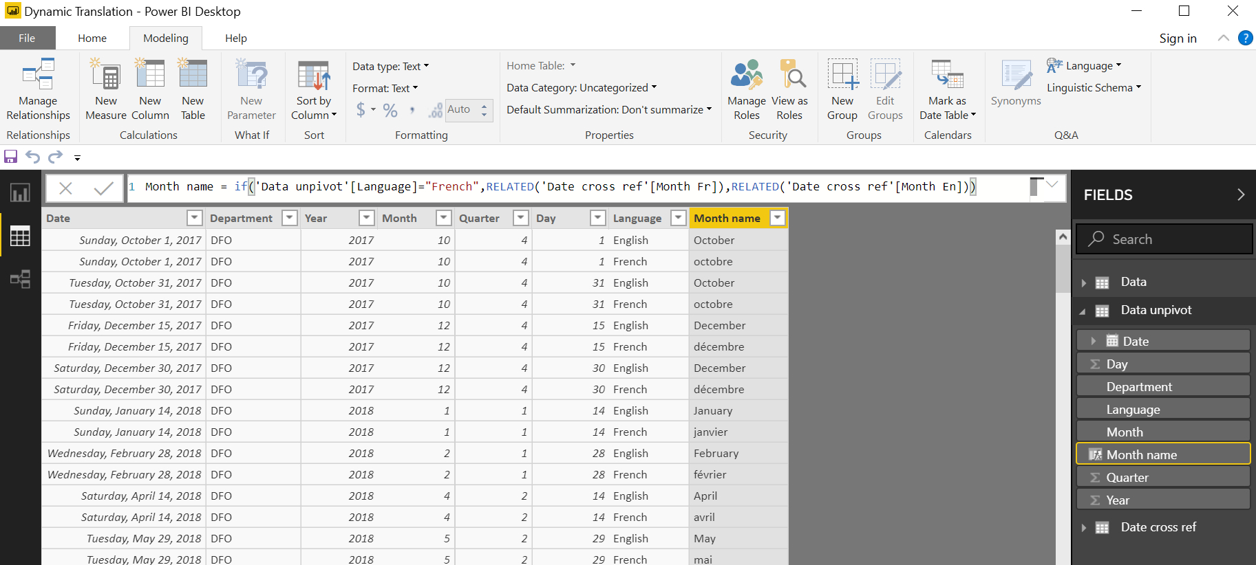
Ok so our next step is to add a calculated column in to add an English or French month depending on the label on that row. In the data view click on the “Data unpivot” table, then click on “Modeling”, then click on “New Column”. In the text field cut and paste the following DAX:
Month name = if('Data unpivot'[Language]="French",RELATED('Date cross ref'[Month Fr]),RELATED('Date cross ref'[Month En]))
What is happening here?
We are using the “RELATED” DAX operation and some logic to look to see if the row is labeled “French” or “English”. When we have that value the then go an take a look at the “Date cross ref” table and the RELATED operator returns the matching month name in the correct language. Click here for more information on the REALATED DAX operation.
Once you have done that you will see the following:
Now hopefully you can see where we are going. Add in a column chart with the axis as “Month name”. If you now add in a slicer that selects “English” or “French” from the Language column the axis will automatically update. If you have no slicer then the chart will show both sets of data (bad). Below I have a screen shot of a chart I created and at the end of this post is the embedded pbix:
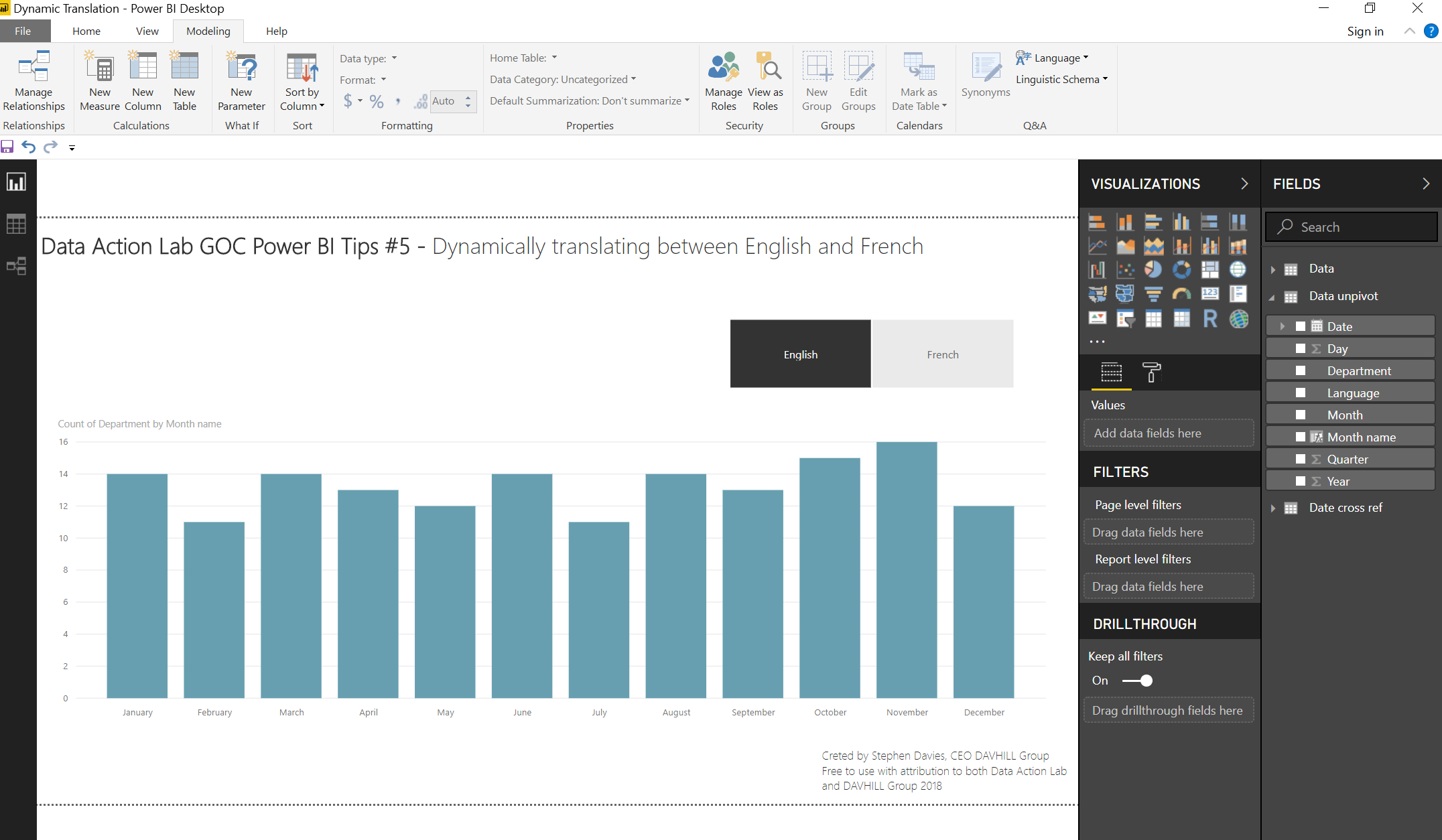
NOTE: the sorting will default to alphabetical because the axis is text and NOT a date. My previous GOC Power BI Tips #3 has a section on how to change the sort to a different column, in this case the “Sort by Column” I used was “Month” in the “Data unpivot” table. As previous stated as we are using text fields rather than native dates we have a non-optimal solutions (e.g. inbuilt date hierarchy) but for a lot of applications having translation functionality like this wins! See below for the embedded pbix to play with: