
by Kyle Kuehni
Data visualizations are tools used by analysts to present information in the form of visuals. Whether it be in the form of graphs, charts, or histograms, visualizations are used to display data in a way that is easy for everyone to understand. It allows the viewer to locate areas of interest in the data that may not have been easy to spot in its raw form.
There are many reasons as to why data visualizations are important in data analytics and data science. Some of the more important reasons include:
- they make it much easier to spot patterns and identify trends in the data;
- they provide businesses with insight to help make business decisions;
- they can be used to summarize and present data analysis results;
- they make it easier for non-specialists to understand the data;
- they can help identify pathways to follow for creating machine learning models
In order to produce these data visualizations, some form of statistical packaging software is needed to aggregate the data and render it meaningfully. One software that is widely used for its data visualizations capabilities is R, and specifically the ggplot2 package. The latter is a very helpful data visualization tool which allows a user to create accurate and aesthetically pleasing visualizations.
This article is a simple tutorial which will provide users with a basic understanding of the ggplot2 package and its various features in order to create detailed data visualizations.
Table of Contents
ggplot2 Basics
Initial Set-Up
The first step in producing any data visualization in R is to install and load the necessary packages for handling the data and producing the visualizations: ggplot2, tidyverse, gridExtra, graphics.
The next step is to load the dataset into the R environment. For this article, we will use a dataset consisting of information collected on board games from the BoardGamesGeek (BGG) website in February 2021. BGG is the largest online collection of board game data and contains data for over 100,000 games (both ranked and unranked). For the purpose of this article, only ranked board games (20,000+) are used.
Now, we will load the data and take a quick look at it:
> BG_Data <- read.csv("C:/ ... /bgg_dataset.csv", sep = ";", dec = ",", stringsAsFactors = FALSE)
> glimpse(BG_Data)
> summary(BG_Data)
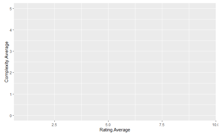
We see that there are 14 variables in the dataset:
- a game ID,
- the name of the game,
- the year the game was published,
- the minimum and maximum number of players recommended to play the game,
- the average game length in minutes,
- the minimum age recommended to play the game,
- the number of users that rated the game,
- the average user rating,
- the BoardGamesGeek ranking of the game,
- the average complexity of the game,
- the number of users that own the game, and
- the logistics and style of the game.
We also find that there are some interesting statistics in this dataset. For instance, the Year.Published variable has a minimum value of -3500! There are actually 10 games that have a negative publishing year which means that these games were actually invented before the Common Era. We can also see that the majority of games take approximately an hour and a half or less to complete and have a minimum recommended player age of 12 years or younger. Finally, we can see that the user rating averages are on a scale from 1 to 10 while the complexity averages are on a scale from 1 to 5, but there are some games that have a complexity average of 0 indicating that no complexity average was calculated for that game.
Creating a Basic Plot
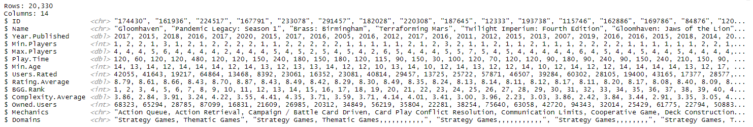
Now that we have imported the data and have gotten familiar with the variables, we need to learn the essentials of ggplot2 before we can start to specialize our designs. The first variable that the ggplot() function takes is the data that is being used to make up the visualization:
#This code doesn't produce any result since no variables were chosen yet.
> ggplot(data = BG_Data)
The next step is to define an aesthetic mapping using the aes() function. We use the aes() function to indicate which data variables we want in the plot and how to present them in the graph:
> ggplot(data = BG_Data, aes(x = Rating.Average, y = Complexity.Average))
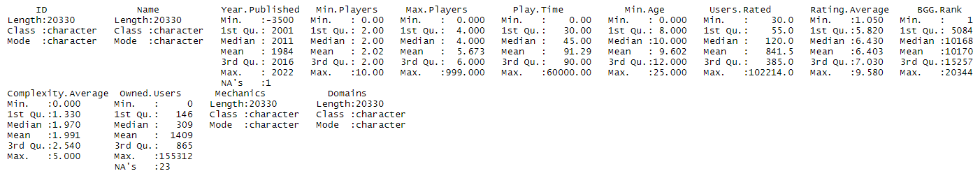
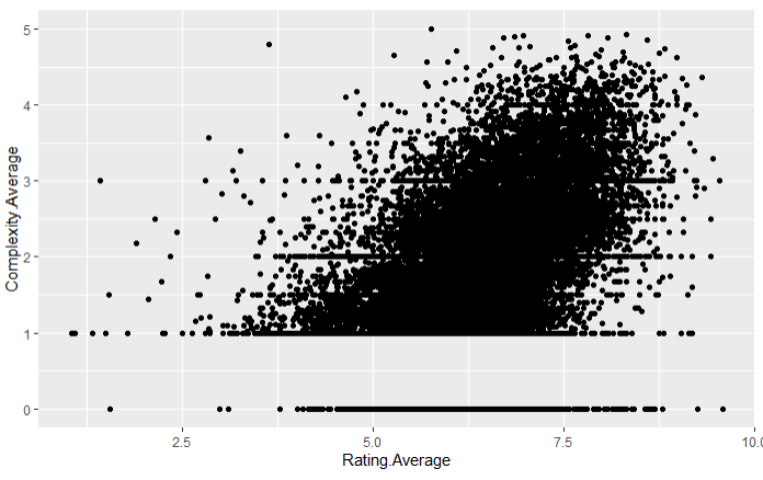
The last step to produce a basic working plot is to include the specific geom that we want to use. A geom is another word for a graphical representation (geometry), such as points, lines, or bars. To select the geom that we are looking for, we need to add a ‘+’ after the ggplot() function and use the geom function of our choice afterwards:
> ggplot(data = BG_Data, aes(x = Rating.Average, y = Complexity.Average)) +
     geom_point()
There are many other geoms is use, such as bars or lines:
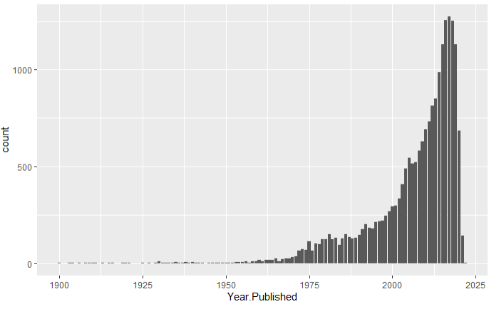
BG_Data$Count = 1
> BG_Data <- BG_Data |> subset(1900 <= Year.Published) |> group_by(Year.Published) |>
     mutate(sum.y = sum(Count))
> ggplot(data = BG_Data, aes(x = Year.Published)) +
     geom_bar()
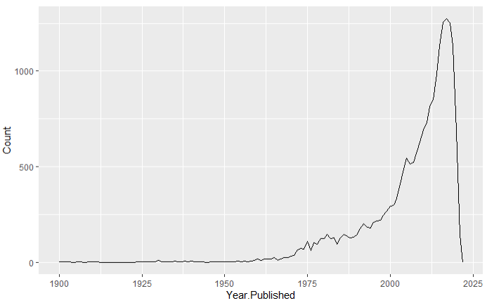
> ggplot(data = BG_Data, aes(x = Year.Published, y = Count)) +
     geom_line(aes(y = sum.y))
Modifying the Aesthetics of the Plot Points/Lines/Bars
The next step in creating a detailed plot is to modify the physical components in order to make the plot visually appealing. First, we can change the color of the geom by typing ‘color = “…”‘ inside the geom, where the colour of choice is placed inside the double quotations:
> ggplot(data = BG_Data, aes(x = Rating.Average, y = Complexity.Average)) +
     geom_point(color = "blue")
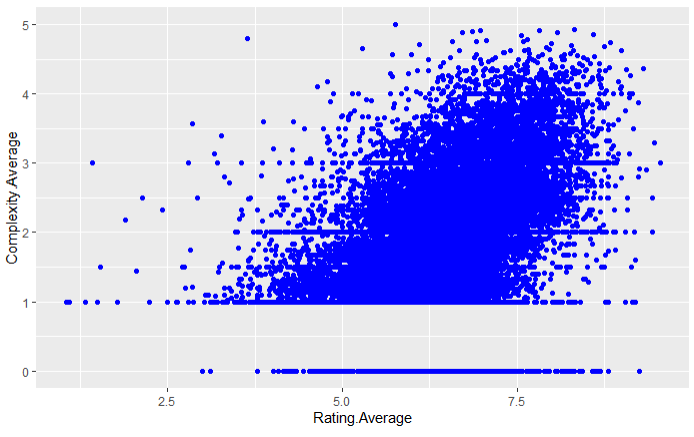
The same process works for line graphs. For bar graphs, the ‘color = “…”‘ function is used to change the color of the bar outline and the ‘fill = “…”‘ function is used to change the color of the inside of the bars. Next, we can change the size of points by using ‘size = …’ inside the geom:
> ggplot(data = BG_Data, aes(x = Rating.Average, y = Complexity.Average)) +
     geom_point(color = "blue", size = 0.5)
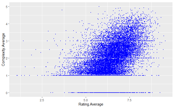
Changing the size of a line in a line plot is the same as above. For bar plots, the process is a little different. There is a function ‘binwidth = … ‘ which can be used, but this function changes the number of bars that we want to show on your plot instead of changing the actual widths of the bars on the plot.
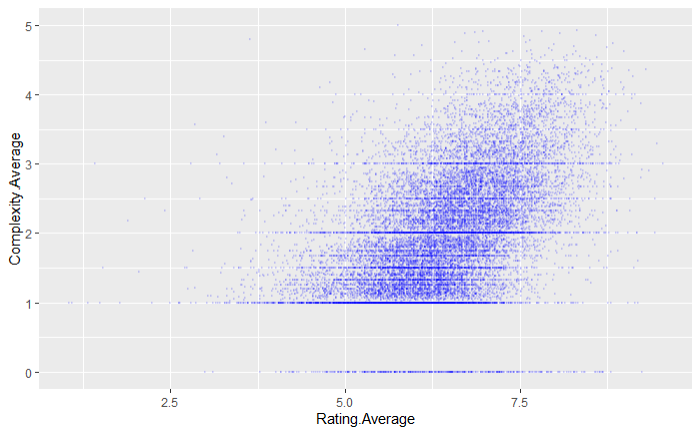
Another aesthetic that can be changed is the transparency of the plot elements. Using the ‘alpha = …’ function, we can modify the transparency of the plot elements with 0 being invisible and 1 being fully visible:
> ggplot(data = BG_Data, aes(x = Rating.Average, y = Complexity.Average)) +
     geom_point(color = "blue", size = 0.5, alpha = 0.1)
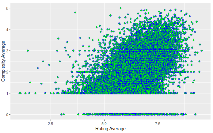
Lastly, we can modify the shape of plot points in geom_point by using the ‘shape = …’ function. There are a number of different shapes that can be used, some of which are automatically filled in whereas other shapes have just the border colored in and we can use the ‘fill = “…”‘ function to change the inside color of the points:
> ggplot(data = BG_Data, aes(x = Rating.Average, y = Complexity.Average)) +
     geom_point(color = "blue", shape = 23, fill = "green")
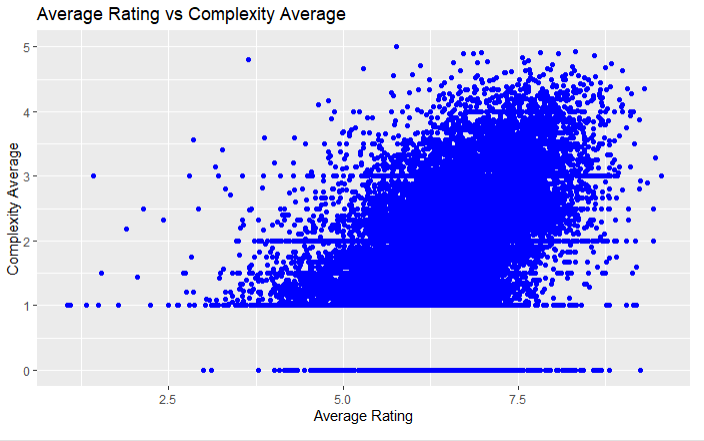
Changing the Plot Titles and Axis Labels and Limits
Next, we will go over how to change the title and axis labels of a plot. There are two ways to modify the labels of a plot, either by using a bunch of functions that are designed to each change one specific label or by using the ‘labs()’ function to change all labels at once:
> ggplot(data = BG_Data, aes(x = Rating.Average, y = Complexity.Average)) +
     geom_point(color = "blue") +
     ggtitle("Average Rating vs Complexity Average") +
     xlab("Average Rating") +
     ylab("Complexity Average")

> ggplot(data = BG_Data, aes(x = Rating.Average, y = Complexity.Average)) +
     geom_point(color = "blue") +
     labs(title = "Average Rating vs Complexity Average", x = "Average Rating", y = "Complexity Average")
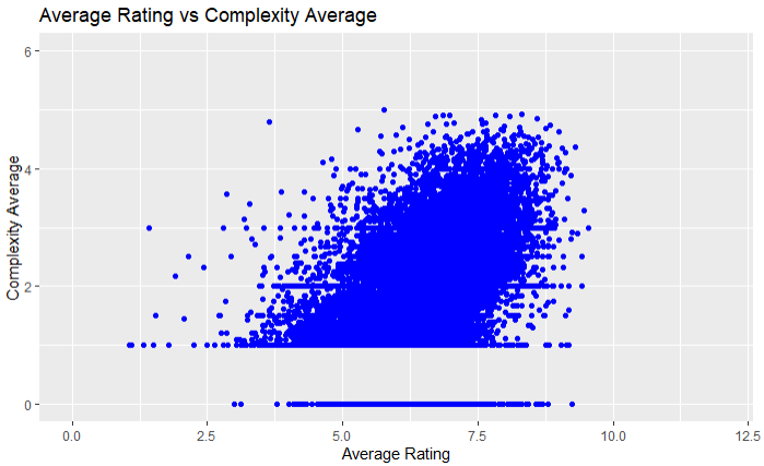
Next, we can adjust the limits of the x and y axes by using the ‘xlim(c(…))’ and ‘ylim(c(…))’ functions to set the lower and upper bounds of both axes:
> ggplot(data = BG_Data, aes(x = Rating.Average, y = Complexity.Average)) +
     geom_point(color = "blue") +
     labs(title = "Average Rating vs Complexity Average", x = "Average Rating", y = "Complexity Average") +
     xlim(c(0, 12)) +
     ylim(c(0, 6))
Adding and Modifying Legends
The next part of this section is to introduce legends into our plots. In ggplot2, legends are used to label the modifications that have been made to the elements to plot, whether it be changing the color of the bars, the shape of the points, etc… Mainly, legends are used when we want to add another variable to the plot and use the plot element aesthetics to distinguish the values of the newly added variable:
# Create variable that indicates the decade when the game was published
# (i.e. a game made between 1900 and 1909 has a value of 1)
> BG_Data <- BG_Data |> mutate(Decade = case_when(Year.Published < 1970 ~ "Pre-1970",
     Year.Published < 1980 ~ "1970-79",
     Year.Published < 1990 ~ "1980-89",
     Year.Published < 2000 ~ "1990-99",
     Year.Published < 2010 ~ "2000-09",
     Year.Published >= 2010 ~ "2010+", ))
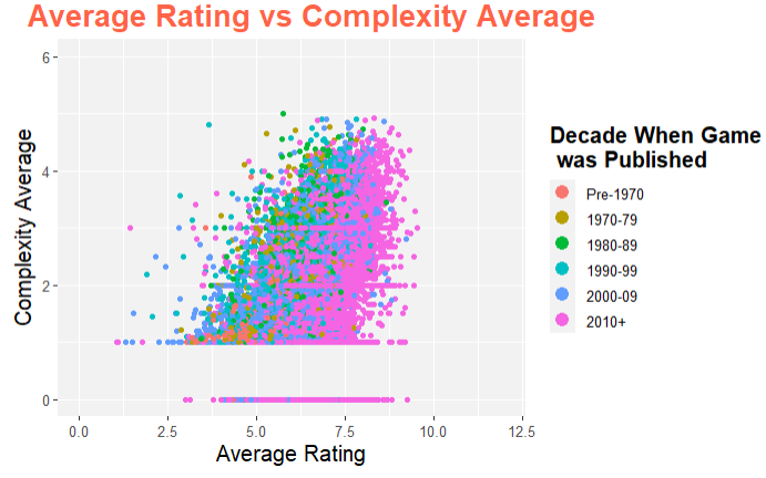
ggplot(data = BG_Data, aes(x = Rating.Average, y = Complexity.Average)) +
geom_point(aes(color = Decade)) +
labs(title = "Average Rating vs Complexity Average", x = "Average Rating", y = "Complexity Average") +
xlim(c(0, 12)) +
ylim(c(0, 6))
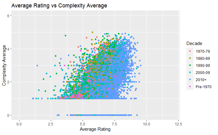
In the plot above, the year that a game was published is assigned a color based on which decade that year falls into. This same process can be done with the point shape, size, or a combination of the three. This can also be done with line graphs where we can choose the line color, style, or size.
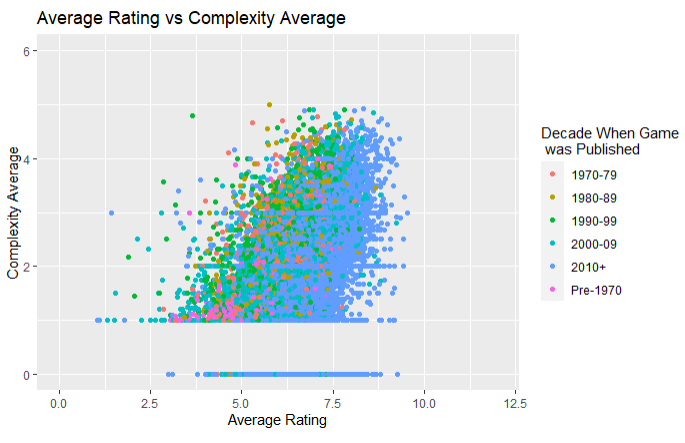
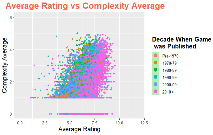
Next, we will show how to change the title of the legend and how to rearrange the order of the legend so that "Pre-1970" is at the top of the legend. In order to change the legend title, we will write a new function inside the labs() function that represents the plot element aesthetic that was chosen to be used in the legend (in our example it was the color aesthetic). We then set 'color = "Decade When Game was Published"' and this will change the title of the legend. If our plot element aesthetic was the shape of the points, then we would set 'shape = "..."' instead.
> ggplot(data = BG_Data, aes(x = Rating.Average, y = Complexity.Average)) +
     geom_point(aes(color = Decade)) +
     labs(title = "Average Rating vs Complexity Average", x = "Average Rating",
     y = "Complexity Average", color = "Decade When Game \n was Published") +
     xlim(c(0, 12)) +
     ylim(c(0, 6))
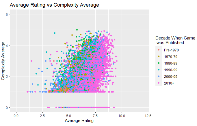
Lastly, we can reorder the legend by first changing the class of the Decade variable from character to factor using factor() and then we can manually rearrange the labels using the 'levels = c(...)' function inside factor() into the order that we want:
> BG_Data$Decade <- factor(BG_Data$Decade, levels = c("Pre-1970", "1970-79", "1980-89",
"1990-99", "2000-09", "2010+"))
> ggplot(data = BG_Data, aes(x = Rating.Average, y = Complexity.Average)) +
     geom_point(aes(color = Decade)) +
     labs(title = "Average Rating vs Complexity Average", x = "Average Rating",
     y = "Complexity Average", color = "Decade When Game \n was Published") +
     xlim(c(0, 12)) +
     ylim(c(0, 6))
Using Different Themes in ggplot2
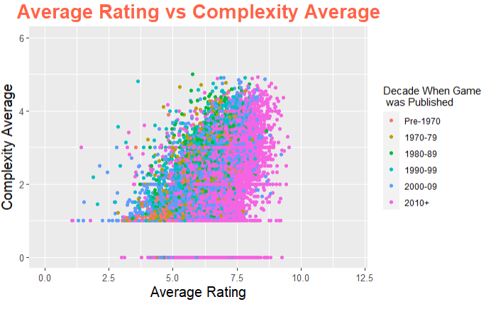
The next section of this article is going over how to customize the layout of the plot using the theme() function. The components that are passed into the theme() function are required to be set to an element type. The four major element types are: element_text() modifies any textual item, element_line() adjusts line based components, element_rect() modifies rectangle components, and element_blank() turns off displaying the theme item.
There are a lot of themes that can be used for any plot, regardless of the data used and the layout of the data. The first theme is changing the textual components of the plot. By using element_text(), we can modify the size, color, face, and line-height of any text on the plot:
> ggplot(data = BG_Data, aes(x = Rating.Average, y = Complexity.Average)) +
     geom_point(aes(color = Decade)) +
     labs(title = "Average Rating vs Complexity Average", x = "Average Rating",
     y = "Complexity Average", color = "Decade When Game \n was Published") +
     xlim(c(0, 12)) +
     ylim(c(0, 6)) +
     theme(plot.title = element_text(size = 20, face = "bold", colour = "tomato", hjust = 0.5),
     axis.title.x = element_text(size = 15), axis.title.y = element_text(size = 15, vjust = 2),
     axis.text = element_text(size = 10))
Next, we can use theme() and other thematic functions to modify the legend and its components:
> ggplot(data = BG_Data, aes(x = Rating.Average, y = Complexity.Average)) +
     geom_point(aes(color = Decade)) +
     labs(title = "Average Rating vs Complexity Average", x = "Average Rating",
     y = "Complexity Average", color = "Decade When Game \n was Published") +
     xlim(c(0, 12)) +
     ylim(c(0, 6)) +
     theme(plot.title = element_text(size = 20, face = "bold", colour = "tomato", hjust = 0.3),
     axis.title.x = element_text(size = 15),
     axis.title.y = element_text(size = 15, vjust = 2),
     axis.text = element_text(size = 10),
     legend.title = element_text(size = 15, face = "bold"),
     legend.text = element_text(size = 10),
     legend.key = element_rect(fill = "darkseagreen2")) +
     guides(colour = guide_legend(override.aes = list(size = 4)))
The guides() function can also be used to modify some of the aesthetics of the plot. In the plot above, the guides() function was used to increase the size of the points in the legend table.
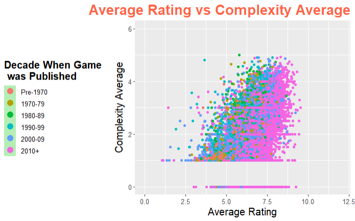
Another use of the theme() function is to reposition the legend or to remove the legend entirely:
# Move legend to the left side of the plot
> ggplot(data = BG_Data, aes(x = Rating.Average, y = Complexity.Average)) +
     geom_point(aes(color = Decade)) +
     labs(title = "Average Rating vs Complexity Average", x = "Average Rating",
     y = "Complexity Average", color = "Decade When Game \n was Published") +
     xlim(c(0, 12)) +
     ylim(c(0, 6)) +
     theme(plot.title = element_text(size = 20, face = "bold", colour = "tomato", hjust = 1),
     axis.title.x = element_text(size = 15),
     axis.title.y = element_text(size = 15, vjust = 2),
     axis.text = element_text(size = 10),
     legend.title = element_text(size = 15, face = "bold"),
     legend.text = element_text(size = 10),
     legend.key = element_rect(fill = "darkseagreen2"),
     legend.position = "left") +
     guides(colour = guide_legend(override.aes = list(size = 4)))
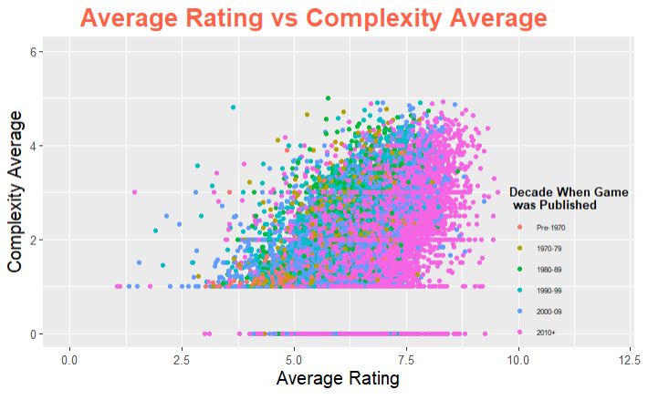
# Move legend to the bottom-right, inside the plot
> ggplot(data = BG_Data, aes(x = Rating.Average, y = Complexity.Average)) +
     geom_point(aes(color = Decade)) +
     labs(title = "Average Rating vs Complexity Average", x = "Average Rating",
     y = "Complexity Average", color = "Decade When Game \n was Published") +
     xlim(c(0, 12)) +
     ylim(c(0, 6)) +
     theme(plot.title = element_text(size = 20, face = "bold", colour = "tomato", hjust = 0.3),
     axis.title.x = element_text(size = 15),
     axis.title.y = element_text(size = 15, vjust = 2),
     axis.text = element_text(size = 10),
     legend.title = element_text(size = 10, face = "bold"),
     legend.text = element_text(size = 6),
     legend.key = element_blank(),
     legend.position = c(0.95, 0.05),
     legend.background = element_blank(),
     legend.justification = c(0.75,0.1))
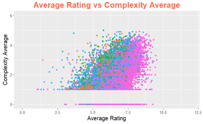
# Remove the legend from the plot
> ggplot(data = BG_Data, aes(x = Rating.Average, y = Complexity.Average)) +
     geom_point(aes(color = Decade)) +
     labs(title = "Average Rating vs Complexity Average", x = "Average Rating", y = "Complexity Average", color = "Decade When Game \n was Published") +
     xlim(c(0, 12)) +
     ylim(c(0, 6)) +
     theme(plot.title = element_text(size = 20, face = "bold", colour = "tomato", hjust = 0.5),
     axis.title.x = element_text(size = 15),
     axis.title.y = element_text(size = 15, vjust = 2),
     axis.text = element_text(size = 10),
     legend.position = "None")
Themes can also be used to modify the graph/panel background color (but less is more!):
> ggplot(data = BG_Data, aes(x = Rating.Average, y = Complexity.Average)) +
     geom_point(aes(color = Decade)) +
     labs(title = "Average Rating vs Complexity Average", x = "Average Rating",
     y = "Complexity Average", color = "Decade When Game \n was Published") +
     xlim(c(0, 12)) +
     ylim(c(0, 6)) +
     theme(plot.title = element_text(size = 20, face = "bold", colour = "tomato", hjust = 0.3),
     axis.title.x = element_text(size = 15),
     axis.title.y = element_text(size = 15, vjust = 2),
     axis.text = element_text(size = 10),
     legend.title = element_text(size = 15, face = "bold"),
     legend.text = element_text(size = 10),
     legend.key = element_rect(fill = "darkseagreen2"),
     panel.background = element_rect(fill = "darkseagreen2", colour = "darkseagreen2"),
     panel.grid.major = element_line(size = 0.5, linetype = "solid", colour = "white"),
     panel.grid.minor = element_line(size = 0.25, linetype = "solid", colour = "white")) +
     guides(colour = guide_legend(override.aes = list(size = 4)))
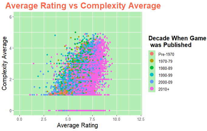
We can also just change the background color of the plot and keep the main panel the same, as well as removing the panel grid lines if we want:
> ggplot(data = BG_Data, aes(x = Rating.Average, y = Complexity.Average)) +
     geom_point(aes(color = Decade)) +
     labs(title = "Average Rating vs Complexity Average", x = "Average Rating",
     y = "Complexity Average", color = "Decade When Game \n was Published") +
     xlim(c(0, 12)) +
     ylim(c(0, 6)) +
     theme(plot.title = element_text(size = 20, face = "bold", colour = "tomato", hjust = 0.3),
     axis.title.x = element_text(size = 15),
     axis.title.y = element_text(size = 15, vjust = 2),
     axis.text = element_text(size = 10),
     legend.title = element_text(size = 15, face = "bold"),
     legend.text = element_text(size = 10),
     legend.key = element_rect(fill = "darkseagreen2"),
     legend.background = element_rect(fill = "darkseagreen2"),
     plot.background = element_rect(fill = "darkseagreen2"),
     panel.background = element_rect(fill = "white"),
     panel.grid.major = element_blank(),
     panel.grid.minor = element_blank())
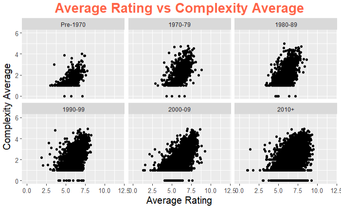
Incorporating Multiple Plots Within One Figure
It is also possible to place multiple plots on the same page. This can be done by using one of two functions: facet_wrap() or grid_arrange().
Using facet_wrap
The facet_wrap() function can be used to break down a large plot into multiple smaller plots based on factor levels. The main argument of the function is a formula where everything to the left of the ~ forms the rows and everything to the right forms the columns:
# Facet wrap using a common scale
> ggplot(data = BG_Data, aes(x = Rating.Average, y = Complexity.Average)) +
     geom_point() +
     labs(title = "Average Rating vs Complexity Average", x = "Average Rating",
     y = "Complexity Average", color = "Decade When Game \n was Published") +
     xlim(c(0, 12)) +
     ylim(c(0, 6)) +
     theme(plot.title = element_text(size = 20, face = "bold", colour = "tomato", hjust = 0.5),
     axis.title.x = element_text(size = 15), axis.title.y = element_text(size = 15, vjust = 2),
     axis.text = element_text(size = 10)) +
     facet_wrap( ~ Decade, nrow = 2)
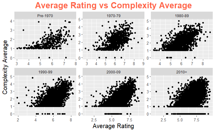
# Facet wrap using free scales
> ggplot(data = BG_Data, aes(x = Rating.Average, y = Complexity.Average)) +
     geom_point() +
     labs(title = "Average Rating vs Complexity Average", x = "Average Rating",
     y = "Complexity Average", color = "Decade When Game \n was Published") +
     theme(plot.title = element_text(size = 20, face = "bold", colour = "tomato", hjust = 0.5),
     axis.title.x = element_text(size = 15), axis.title.y = element_text(size = 15, vjust = 2),
     axis.text = element_text(size = 10)) +
     facet_wrap( ~ Decade, nrow = 2, scales = "free")
Using grid_arrange
Another option to lay out multiple plots onto a single page is to use the grid_arrange() function in the gridExtra package. This function takes plots in as input and then the number of columns and/or rows are listed to indicate the size of the grid of plots:
> BG_Data1 <- BG_Data |> subset(Decade == "Pre-1970")
     p1 <- ggplot(data = BG_Data1, aes(x = Rating.Average, y = Complexity.Average)) +
     geom_point() +
     labs(title = "Average Rating vs Complexity \n Average Pre-1970", x = "Average Rating", y = "Complexity Average") +
     theme(plot.title = element_text(size = 10, face = "bold", colour = "tomato", hjust = 0.5), axis.title.x = element_text(size = 7), axis.title.y = element_text(size = 7, vjust = 2))
> BG_Data2 <- BG_Data |> subset(Decade == "1970-79")
     p2 <- ggplot(data = BG_Data2, aes(x = Rating.Average, y = Complexity.Average)) +
     geom_point() +
     labs(title = "Average Rating vs Complexity \n Average From 1970-79", x = "Average Rating", y = "Complexity Average") +
     theme(plot.title = element_text(size = 10, face = "bold", colour = "tomato", hjust = 0.5), axis.title.x = element_text(size = 7), axis.title.y = element_text(size = 7, vjust = 2))
> BG_Data3 <- BG_Data |> subset(Decade == "1980-89")
     p3 <- ggplot(data = BG_Data3, aes(x = Rating.Average, y = Complexity.Average)) +
     geom_point() +
     labs(title = "Average Rating vs Complexity \n Average From 1980-89", x = "Average Rating", y = "Complexity Average") +
     theme(plot.title = element_text(size = 10, face = "bold", colour = "tomato", hjust = 0.5), axis.title.x = element_text(size = 7), axis.title.y = element_text(size = 7, vjust = 2))
> BG_Data4 <- BG_Data |> subset(Decade == "1990-99")
     p4 <- ggplot(data = BG_Data4, aes(x = Rating.Average, y = Complexity.Average)) +
     geom_point() +
     labs(title = "Average Rating vs Complexity \n Average From 1990-99", x = "Average Rating", y = "Complexity Average") +
     theme(plot.title = element_text(size = 10, face = "bold", colour = "tomato", hjust = 0.5), axis.title.x = element_text(size = 7), axis.title.y = element_text(size = 7, vjust = 2))
> BG_Data5 <- BG_Data |> subset(Decade == "2000-09")
     p5 <- ggplot(data = BG_Data5, aes(x = Rating.Average, y = Complexity.Average)) +
     geom_point() +
     labs(title = "Average Rating vs Complexity \n Average From 2000-09", x = "Average Rating", y = "Complexity Average") +
     theme(plot.title = element_text(size = 10, face = "bold", colour = "tomato", hjust = 0.5), axis.title.x = element_text(size = 7), axis.title.y = element_text(size = 7, vjust = 2))
> BG_Data6 <- BG_Data |> subset(Decade == "2010+")
     p6 <- ggplot(data = BG_Data6, aes(x = Rating.Average, y = Complexity.Average)) +
     geom_point() +
     labs(title = "Average Rating vs Complexity \n Average After 2010", x = "Average Rating", y = "Complexity Average") +
     theme(plot.title = element_text(size = 10, face = "bold", colour = "tomato", hjust = 0.5), axis.title.x = element_text(size = 7), axis.title.y = element_text(size = 7, vjust = 2))
> grid.arrange(p1, p2, p3, p4, p5, p6, ncol = 3)
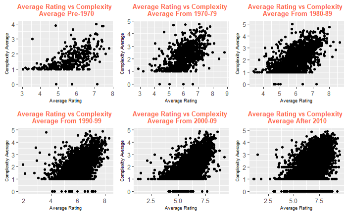
Although the above example used six very similar plots that varied over the decade in which the board games were published, grid.arrange() can be used to place any ggplot2 plot on the same page, regardless of the data or plot type.
Why is ggplot2 Preferable to R Base Graphics?
In R, there is always more than one way to complete a single task. The same is true with data visualizations. There are many packages in R that can be used to create data visualizations, but the ggplot2 package shown above is by far the most popular. R also comes with a built-in functionality for plots which is usually referred to as R base graphics. These two methods are typically what is used to create data visualizations, but is there a way to show if one of the methods is better than the other? Let's compare the two methods side by side and see if one outperforms the other.
Comparing R Base Graphics with ggplot2
We will first look at comparing the basic scatter plot that we had created using ggplot2 with the basic scatter plot created using the R base graphics:
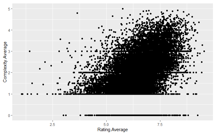
# Scatter plot using ggplot2
> ggplot(data = BG_Data, aes(x = Rating.Average, y = Complexity.Average)) +
     geom_point()
# Scatter plot using R base graphics
> plot(x = BG_Data$Rating.Average, y = BG_Data$Complexity.Average)
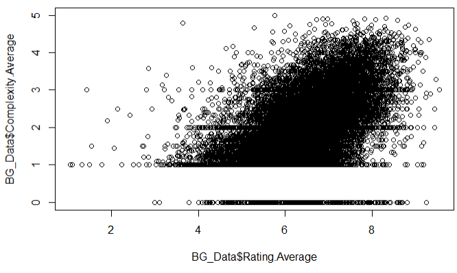
As seen above, the two plots are essentially the same but with minor differences. The ggplot scatter plot has a light grey background with white grid lines set as a default while the R base scatter plot has a plain white background with a black border. The axis titles are slightly different but changing these titles (and adding a plot title) are both very easy to do. The last minor difference is that the ggplot has filled in data points as a default while the R base graphics plot has circles set as a default for the data points.
Next, we will compare basic bar plots of both data visualizations methods:
# Bar plot using ggplot2
> ggplot(data = BG_Data, aes(x = Year.Published)) +
     geom_bar()

# Bar plot using base R graphics
> Count <- table(BG_Data$Year.Published)
barplot(height = Count)
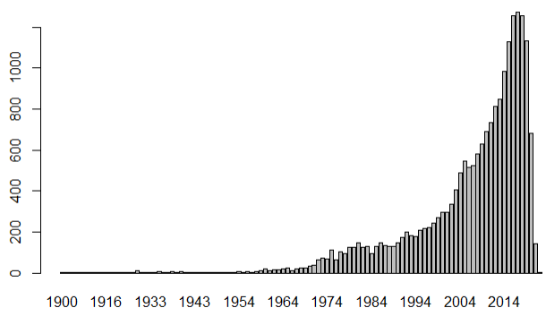
Again, the plots have the same default backgrounds as before. The main difference between the two is that the R base plot has borders around the bars set as a default whereas the ggplot does not which makes looking at the different bars a little more difficult. That being said, using 'color = "..."' inside geom_bar() will easily put a colored border around the bars to make the individual bars stand out like in the R base plot.
The last comparison that we will make involves basic line graphs:
# Line graph using ggplot2
> ggplot(data = BG_Data, aes(x = Year.Published, y = Count)) +
     geom_line(aes(y = sum.y))

# Line graph using base R graphics
> Count <- unique(BG_Data[c("Year.Published", "sum.y")])
> Count <- Count[order(Count$Year.Published),]
> plot(x = Count$Year.Published, y = Count$sum.y, type = "l", lty = 2)
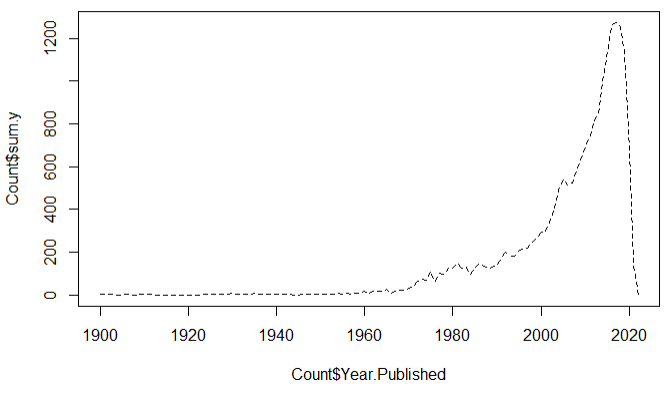
The 'sum.y' variable was the same one that was created at the beginning of the article. Looking at these two plots, they have produced the same results as the scatter plots in terms of the default layout and design of the data. However, there is a big difference between these two line graphs that does not occur in the scatter plots. This difference is that in the R base graphics, the way the data is ordered is the way the data is displayed. Therefore, in the example above the data had to be ordered so that the publishing years were always increasing. This is the only way to get a straight line for a line graph when using the R base graphics. ggplot2 does not have this problem and can input the data in any order and display the data in a straight line.
After creating these three different plots using both R base graphics and ggplot2, we can see that the default graph settings are essentially the same. The differences between these two methods becomes more apparent when the graphs become more complex. When adding more components to the plots or modifying the aesthetics of the plots, the end results of each method look more and more different. We will show an example of how these methods can produce two different results of the same data. The first plot comes from an earlier example using ggplot2 while the second plot recreates the first using R base graphics:
> ggplot(data = BG_Data, aes(x = Rating.Average, y = Complexity.Average)) +
     geom_point(aes(color = Decade)) +
     labs(title = "Average Rating vs Complexity Average", x = "Average Rating",
     y = "Complexity Average", color = "Decade When Game \n was Published") +
     xlim(c(0, 12)) +
     ylim(c(0, 6)) +
     theme(plot.title = element_text(size = 20, face = "bold", colour = "tomato", hjust = 0.3),
     axis.title.x = element_text(size = 15),
     axis.title.y = element_text(size = 15, vjust = 2),
     axis.text = element_text(size = 10),
     legend.title = element_text(size = 15, face = "bold"),
     legend.text = element_text(size = 10),
     panel.background = element_rect(fill = "gray95"),
     panel.grid.major = element_line(size = 0.5, linetype = "solid", colour = "white"),
     panel.grid.minor = element_line(size = 0.25, linetype = "solid", colour = "white")) +
     guides(colour = guide_legend(override.aes = list(size = 4)))
> plot(x = BG_Data$Rating.Average, y = BG_Data$Complexity.Average, col = BG_Data$Decade, pch = 16, xlab = "Average Rating", ylab = "Complexity Average")
> title(expression("Average Rating vs Complexity Average"), col.main = "tomato"),
> legend(x = 0.75, y = 5, pch = 16, legend = levels(BG_Data$Decade), col = c(1:3), title = "Decade When Game \n was Published", cex = 0.5, box.lty = 0)
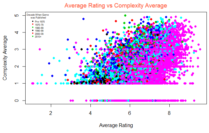
Looking at the two plots above, we can see that the code required to produce the ggplot2 plot was a lot longer than that of the R base graphics plot. That being said, the end result of the ggplot2 plot is much nicer than that of the R base graphics plot. The ggplot2 package has a lot more functionality than the R base graphics, allowing the plot components and aesthetics to be more visually appealing and to provide more information about the data. Overall, both options are excellent for producing good data visualizations with the R base graphics plots requiring less code to write and the ggplot2 plots providing more functionality.