
This is the first in a series of articles where I take a philosophical approach to thinking about data visualizations, and try to develop my own framework to describe the underlying structure of data visualizations. If you enjoy philosophical-type discussions, I recommend that you start with the article below, where I talk about visualization for data exploration vs data communication. In my second and subsequent articles I get more into the nitty-gritty details of my possible data visualization framework by thinking in some detail about how we map structures in a data set onto visual elements in a data visualization. I also talk about how understanding the relationship between the data itself and the visual representation of that data can allow us to experiment with many different visualization options, and possibly even automate the construction of data visualizations, in a limited sense.
What goes into making a good or useful visualization? What are the major graphical elements that need to be considered? To answer these questions, we need to understand that data visualizations have, generally speaking, two main uses – data exploration and data presentation (or communication).
Data Exploration
As a data scientist, I rely heavily on data visualizations when I’m exploring datasets. At the same time, when it comes to visually presenting the results of my analyses to stakeholders and other data consumers, I have no qualms about handing the reins over to people who specialize in creating presentation-focused visualizations, in contrast to the exploration-focused visualizations that I prefer.
Why is this? And why, in general, would I make such a clear separation between these two types of data visualization? What distinguishes them in practice?
Let’s start by supposing that visualizations created during data exploration are intended to allow the data scientist to develop hypotheses about patterns in the data, which can then be confirmed via a more in-depth and rigorous analysis of the data. Used in this way, data visualizations suggest potentially promising avenues for further investigation.
As a data scientist, I regularly use these visualizations, combined with my own intuitions and the results of my algorithms, to extract insight from data that might not otherwise have been obvious or forthcoming.
Data Presentation
By contrast, the goal of presentation-focused visualizations is to powerfully and efficiently convey the relevant findings or key message of the resulting analysis in a visually appealing manner and in a way that is both readily and accurately consumable. Importantly, even in this use case, the visualization elements should enhance the consumer’s ability to understand the underlying data’s true behaviour or patterns, rather than presenting a narrative imposed upon the data.
That these two situations are different seems evident enough, on a superficial level. But is there a substantive distinction between the types of visualizations used for data exploration and data presentation? To answer this question further, and to better understand in some detail the practical differences between these two types of visualizations, I suggest that, fundamentally, it is helpful to view any data visualization, and any element within the visualization, as having a necessary mixture of structural and stylistic qualities, elements or properties.
Structural and Stylistic Elements
Structure refers to the organization of elements – their presence and relationships with each other. We can also think of structure as ‘what is left’ when we abstract away specific perceptual or stylistic details. Here I suggest that the key elements of a data visualization (or any data representation) should reflect, in a precise fashion, the structural elements and underlying patterns of the data itself. There is a specific, defined mapping between the two. I refer to any visual elements, qualities and properties that are involved in this mapping as the structural elements of the visualization because they are specifically connected to the structure of the data.
Within the visualization itself there is also structure, which can be considered separately from the structure of the underlying data. This separation becomes obvious if we consider, for example, an abstract art painting, which has a structure of its own even though it is not representing a dataset. We perceive the structure of a visualization through marks on a canvas that are experienced and processed by our perceptual systems. These marks have specific visual properties – colour, shape etc. – that make this perception possible. Effectively, in the case of data visualizations, the underlying data structures and patterns of the data are revealed through our perception of these markings and their properties. This is possible specifically due to the established similarities between the visualization structures and elements, on the one hand, and the data structures, components and patterns, on the other.
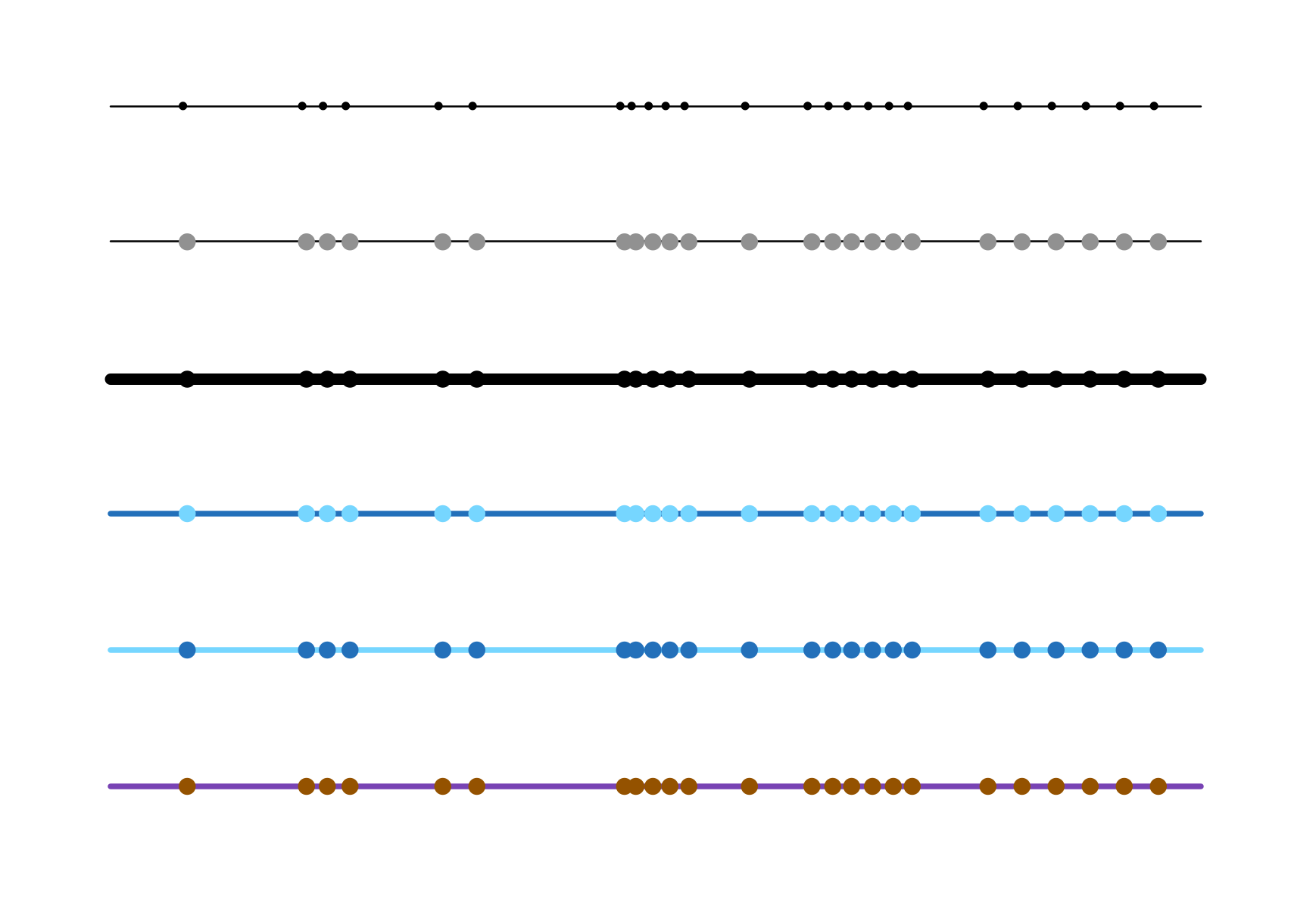
To illustrate what I mean when I say that we must start by creating a mapping between the dataset’s data structures and the data visualization’s visual structures, let me pick a very familiar example: the number line. Abstracting away from the specific stylistic elements used when representing a specific line, lines have a defined abstract structure, which is separate from their visual appearance (for example, a line can be represented by a mathematical equation). As a result of this structure, using a number line we can visually represent the values of a continuous variable through the use of a single straight line running left to right (or up and down) on a page, where the points we position on this line indicate each one of the measured values of the variable, positioned relative to each other’s values (see Figure 1). This mapping works because, like the variable itself, a line is continuous. And like the variable values, a line has a size (a length). Like the individually measured values of the variable, the points on the line can be positioned in a way that precisely shows their values relative to each other.
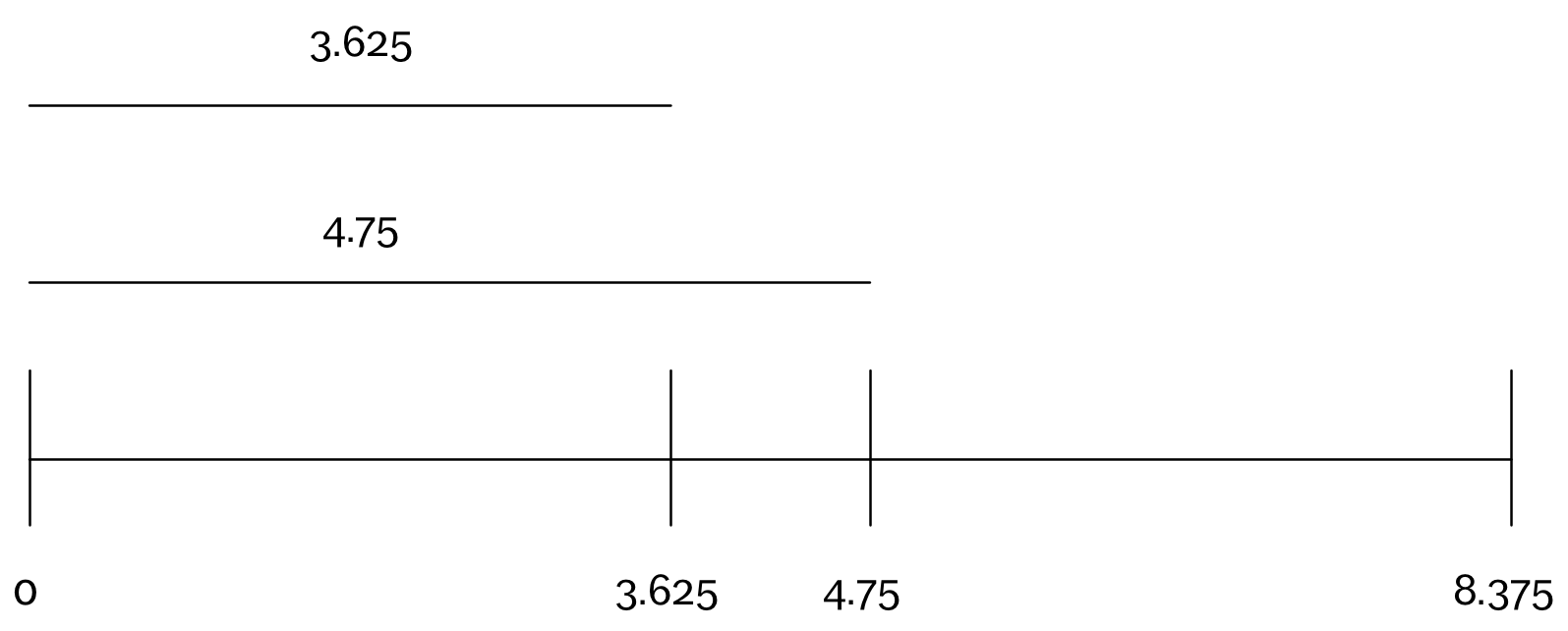
Figure 1
Picking out the mapping between the data and the visualization elements is a necessary part of data visualization. Still, by itself, it is not sufficient to create the visualization. We also need to select the specific perceptual properties of the visualization. Some of them will be determined by the mappings we have chosen, but some will not. Taken together, the choice of mappings and other perceptual properties will determine how we experience the data visualization, how we attend to the elements present in the visualization and subsequently how we extract information from them.
To continue the example above, once we have decided to associate the data variable’s structural elements with the line and points, to create the number line visualization of the variable we must actually choose a thickness for the line and a size for the points and colours for each. The abstract structure must be concretely manifested and specifically drawn. Figure 2 shows a variety of options for doing this, in the case of a number line. For each of the number lines in Figure 2, the mappings between the data and the visual elements are the same. These mappings determine which shapes will be involved (lines and points) and the positioning of the points relative to the line and each other. However, other choices – which I will call stylistic choices – remain. And these choices will necessarily influence our ability to extract information from the visualization and our interpretation of it.
For instance, if we choose to make our points larger and lighter, then our eyes might be more likely to pick out and attend to the points that are positioned more closely together in the visualization, while perhaps also being more likely to ignore those points that are isolated (take a look at the picture in this post – do you agree?) If we make the line very thick, relative to the size of the dots, values that are well separated from others may become even less visually salient, relative to those clustered together (again, do you agree?)
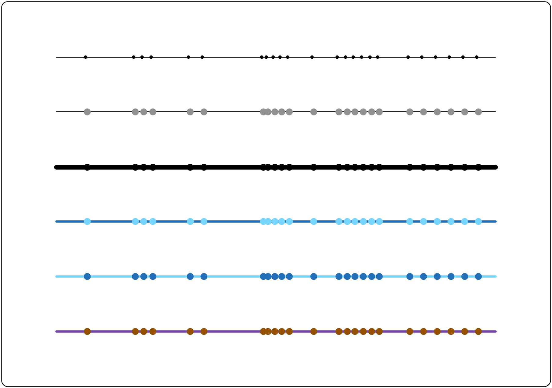
Figure 2
Even within this relatively trivial example, we can see two things: first, that the stylistic properties and structural properties of a visual element are necessarily attached in practice, even if they can be distinguished from each other conceptually, since we experience them both through our perceptual systems. We can only perceive the structure of abstract objects if some perceptual properties (visual, audible, tactile, etc.) are associated with them. Put more simply, we only see the line if we draw it. And second, the interplay between structural and stylistic elements in a visualization is rich and complex.
This complexity becomes even more evident when we consider further the fact that both structural and stylistic aspects of a visualization are perceptual – i.e. they are perceived. In the case of structural elements, however, the choice of how we present them perceptually is determined by how we choose to map them to the data. In contrast, other perceptual elements of the visualization are not constrained by a mapping to the structure of the data, and thus are free to be determined by taking into account stylistic considerations. I will refer to these elements, properties and qualities as the stylistic elements of the visualization.
Consider, for example, the shade or opacity of a visual element such as the dots in a scatterplot. In creating one of these dots, we must choose the shade or opacity of the dot (along with its colour, size, etc.) In some visualizations, the level of opacity of the dots may be solely a stylistic choice. Thus, we can choose the dots based on what we think will work best in terms of the consumer’s attention and interpretation. In other visualizations, however, the dot’s opacity might represent a structural element of the dataset itself. For example, the level of opacity might correspond to the magnitude of the values of a variable. In both cases, a decision must be made about the opacity of the points. In both cases, this choice may influence, from a perceptual perspective, how people extract and interpret information from the visualization. In one of these cases, however, the opacity level is also intended to carry information about the underlying data and must accurately reflect this underlying information. This puts constraints on the visualization choices we can make that would otherwise not be present.
In addition to influencing our ability to extract information from a visualization, perceptual properties may also influence our attitude towards the data visualization as a whole. We can’t easily suppress our sense of aesthetics when engaged with a data visualization. If a data visualizer selects, for example, colours that do not appeal to our sense of aesthetics, we may be unable to look past this choice to focus on the information being presented. Similarly, if we choose colours that have certain associations within our culture – for example, green meaning go and red meaning stop – this may impact our evaluation of the relevance or importance of some data elements over others. In this way, the influence of the perceptual elements of a visualization goes beyond short-term perceptual mechanics and extends into the cognitive, cultural and social realm.
Exploring Through Structural Mapping
Where does this leave me as a data scientist? Typically, when I am starting to work with a dataset, my goal is to gain insight into the data’s underlying structure and patterns. As such, I want to load my data visualizations with as much representational power as I can. This often manifests itself through the use of every possible visual aspect – shape, colour, shade, positions etc. – as an information carrier.
On top of this, because I am most intent, at this point in the process, on extracting the information from the visualization, when viewing the visualization, it is relatively easy for me to block out the aesthetic implications of my visualization choices in favour of paying attention to the underlying informational structures that are displayed. Essentially, if an aspect of a visualization is not acting as an information carrier, I am inclined to dismiss it. A final important factor in my choices is that, in my exploration, I might make hundreds of data visualizations. Given this, picking out, for example, the most perceptually effective colours for any one of these visualizations, or the best line thickness, is relatively low on my list of priorities.
Having said all of this, it would be a terrible mistake to show these visualizations to people further down the data pipeline – in particular, to people who are unfamiliar with the dataset and the analyses in progress. It would also be quite unreasonable to expect these people to gain insight into the data and analyze results from these visualizations, even if the visualizations are genuinely useful to me in this respect. This disconnect occurs because the people down the pipeline are coming at the visualizations from a very different context and typically with different goals. As a result of this difference, when communicating results visually, factoring in the stylistic elements and their effects on the consumer’s attention and perspective is critical.
In addition to being essential, skillfully combining structural and stylistic factors in a visualization is a challenging task. Above, I stated that this interplay, between the structural and stylistic elements of a visualization, is rich and complex: elements in a visualization intended for communication must convey information, but also must take into account attentional, aesthetic, and social elements, which will inevitably be at play when a visualization is presented to a data consumer. Generating such visualizations is a skill that requires both aptitude and extensive practice.
I make this previous remark speaking as someone who tends to wear black clothes daily, to avoid matching my pants and shirts when I get up in the morning. We are not all blessed with an innate sense of aesthetics, graphic design and visual narrative, even though they play a critical role in data communication.From this vantage point, I can offer a few words of advice:
-Appreciate that data visualizations perform multiple functions, and your strengths may lie in one area or another. We cannot be all things to all people.
-Be aware and realistic about your own aptitude, experience and interests in this area, as well as where you would like to go from here.
-Regardless of your aptitude, be willing to practice to improve your data visualization skills, whether the emphasis is on discovery or communication.
-Do not dismiss other relevant uses of visualizations, even if they are not in your preferred arena, and recognize that what might be vitally important in one context may be more or less irrelevant in another.
-Look for other people who are comfortable working with data and whose data visualization and presentation skill sets complement your own. They can be great allies in your efforts to let the data speak and have its message be heard.
3 Replies to “Visualization Elements For Data Exploration and Communication”
Comments are closed.