
This is the third in a series of articles where I take a philosophical approach to thinking about data visualizations, and try to develop my own framework to describe the underlying structure of data visualizations. If you enjoy philosophical-type discussions, I recommend that you start with the first article, here, where I talk about visualization for data exploration vs data communication. In my second article I get more into the nitty-gritty details of my possible data visualization framework. In this third article I talk about how understanding the relationship between the data itself and the visual representation of that data can allow us to experiment with many different visualization options. In my fourth article I talk about the relationship between the visual and framing elements of a visualization.
In my last blog article, where I talked about mapping data variables onto visual variables, I stated that the most fundamental relationships in a dataset were not between the the values of two or more variables in the dataset, but rather between the categorical meta-variables (to slightly abuse an existing term) that determined which values were associated with which datapoint, and also with which variable. In this article, I’ll explore and illustrate this idea further by visualizing these fundamental relationships in the context of a small sample dataset. I’ll also discuss how this most basic structure of datasets can inform how we visualize data and can also inspire us to think outside of the box when we create visualizations. Finally, I’ll speculate on how we might use some of the ideas I present here to start to build data visualizations more ‘from the bottom up’.
With that in mind, I encourage some perseverance at the beginning of this article – it will start out fairly generally, with a focus on the very basic structure of datasets, but my end-goal is for the up-front abstract discussion to lead to something more useful and concrete.
Values as Data Atoms
I like to describe dataset values as the atomic elements of a dataset. Each one of them is a datum, which, when collected together, make data. The values (represented symbolically by numbers and characters) are generated through the act of measurement – they are an output of a measuring event. From this perspective, each value in the dataset represents something specific about the results of this measuring event. If we picture an empty cell in a table that is representing a dataset, we can think of that empty cell as representing, in the abstract, the outputs of any given measurement, or even an act, minus even the value of the measurement itself.
Measurements taken of the same object (often at the same time) are related to each other by virtue of the simple fact that they are measurements of that same object (and/or possibly because they are made at that same point in time). We call a collection of these related values a datapoint. Measurements are also related to each other in a different way when they measure the same property of different objects (or object instances). In a data collection or data set context, we call a collection of values related to the same property a variable. This ties into the idea of random variables in statistics.
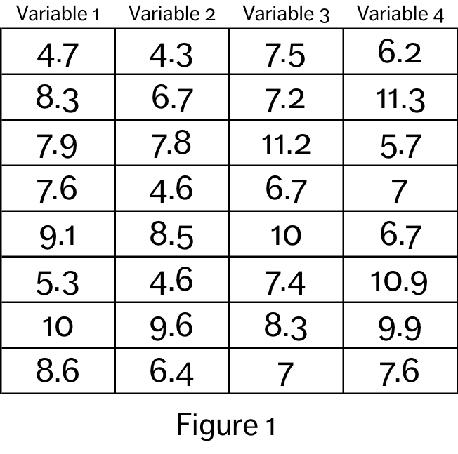
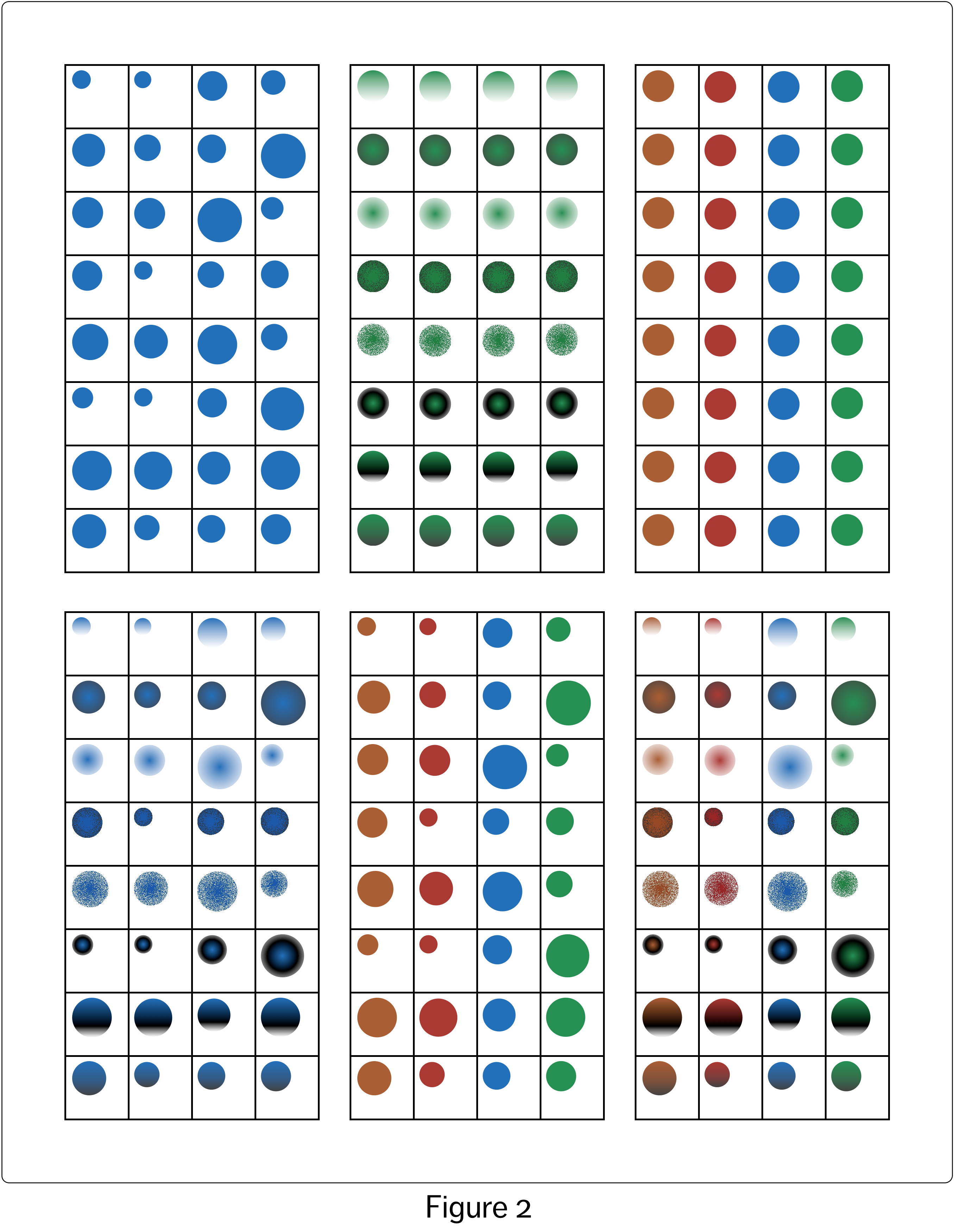
If we view each datum as its own distinct (abstract) object, we can see that there are three properties associated with each datum: value, datapoint membership and variable membership. Figure 1 shows a small sample dataset, and Figure 2 shows each datum in the set represented by a circle. The three datum object properties in the sample dataset – value, datapoint membership and variable membership – can be mapped onto the visual variables of the circles. Each visualization in Figure 2 displays different combinations of these three basic properties (from left to right and top to bottom): value (radius), datapoint membership (pattern), variable membership (colour), value + datapoint membership, value + variable membership, value + datapoint membership + variable membership.
In the case of the bottom right visualization, we could remove the framing grid lines and still see the fundamental structure of the dataset solely by virtue of the size, pattern and colour of the circles. However, it is clear when we compare the two options side by side, shown in Figure 3, that the grid lines and the spatial arrangement of the circles in the grid very much assist our visual systems in making sense of the information embedded in the visualization. Using a perceptual structure that allows the inherent visual assumptions embedded in our visual system to work in our favour is critical to the success of a data visualization.
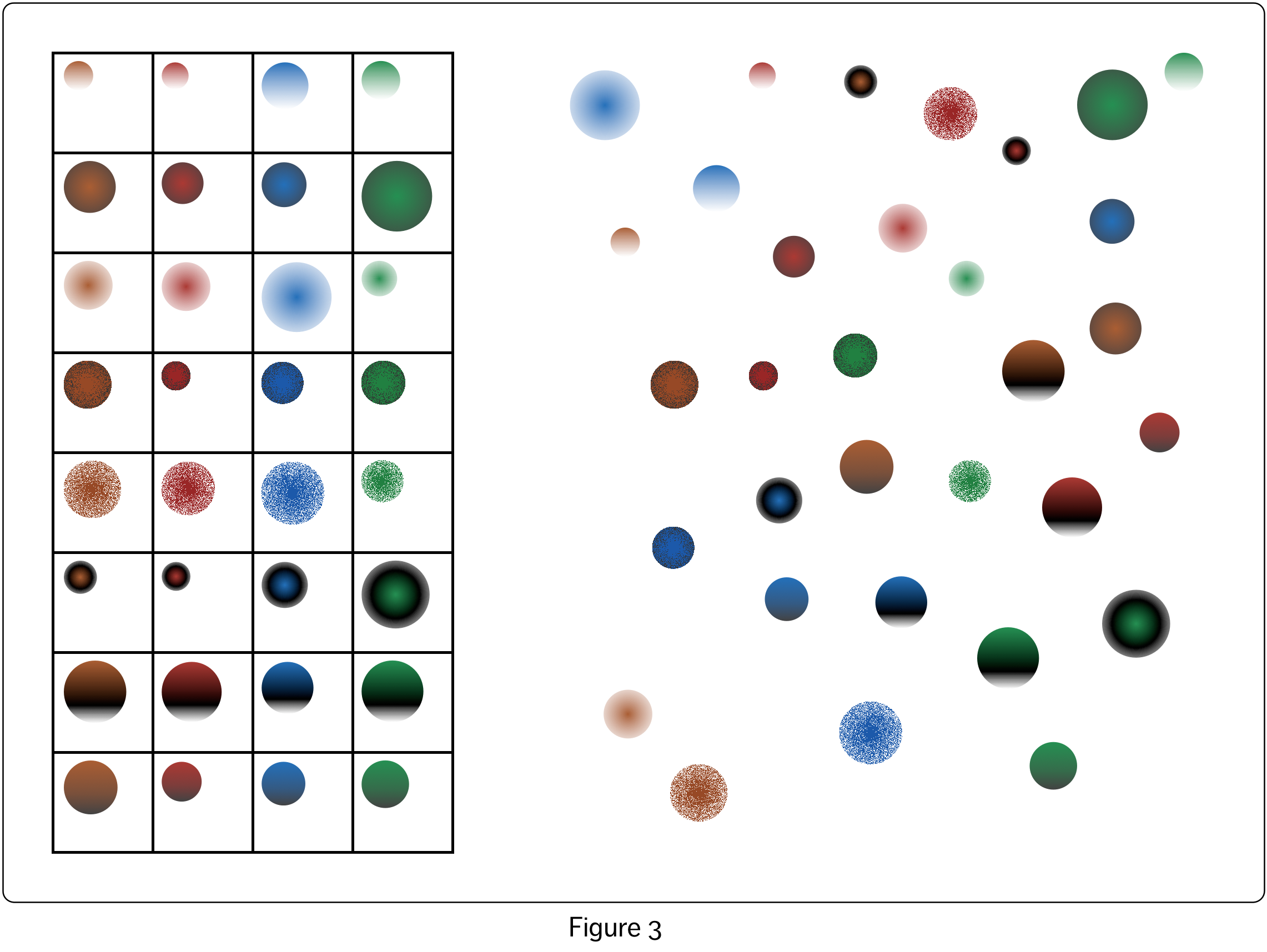
In my previous article, I floated the idea that relationships between variables in data visualizations could be represented either by combining properties representing the visual variables within a single visual object, which is the more common approach, or by more explicitly representing the relationships through the use of connecting lines and the spatial arrangement of the visual objects. If we take this idea to its natural extreme, as shown in the rather monstrous visualization of Figure 4, we can entirely replace the use of colour and pattern with separate lines and spacing. This visualization shows almost the exact same information as that displayed in the right-hand visualization of Figure 3 (if I added directional arrows and possibly a few more lines it would show exactly the same information, but that would be too ugly even for me!) The left hand visualization in Figure 3, in contrast to both of these visualizations, doubles up on representation of the the datapoint and variable relationships – the data in each datapoint are in their own row, and the data in each variable are in their own column, as well as being represented by colour and pattern. The grid pattern also makes the ordering obvious – Variable 1 values are to the left of Variable 2 values, for example. In Figure 4 this must be deduced by taking into account the values represented by the circle size.
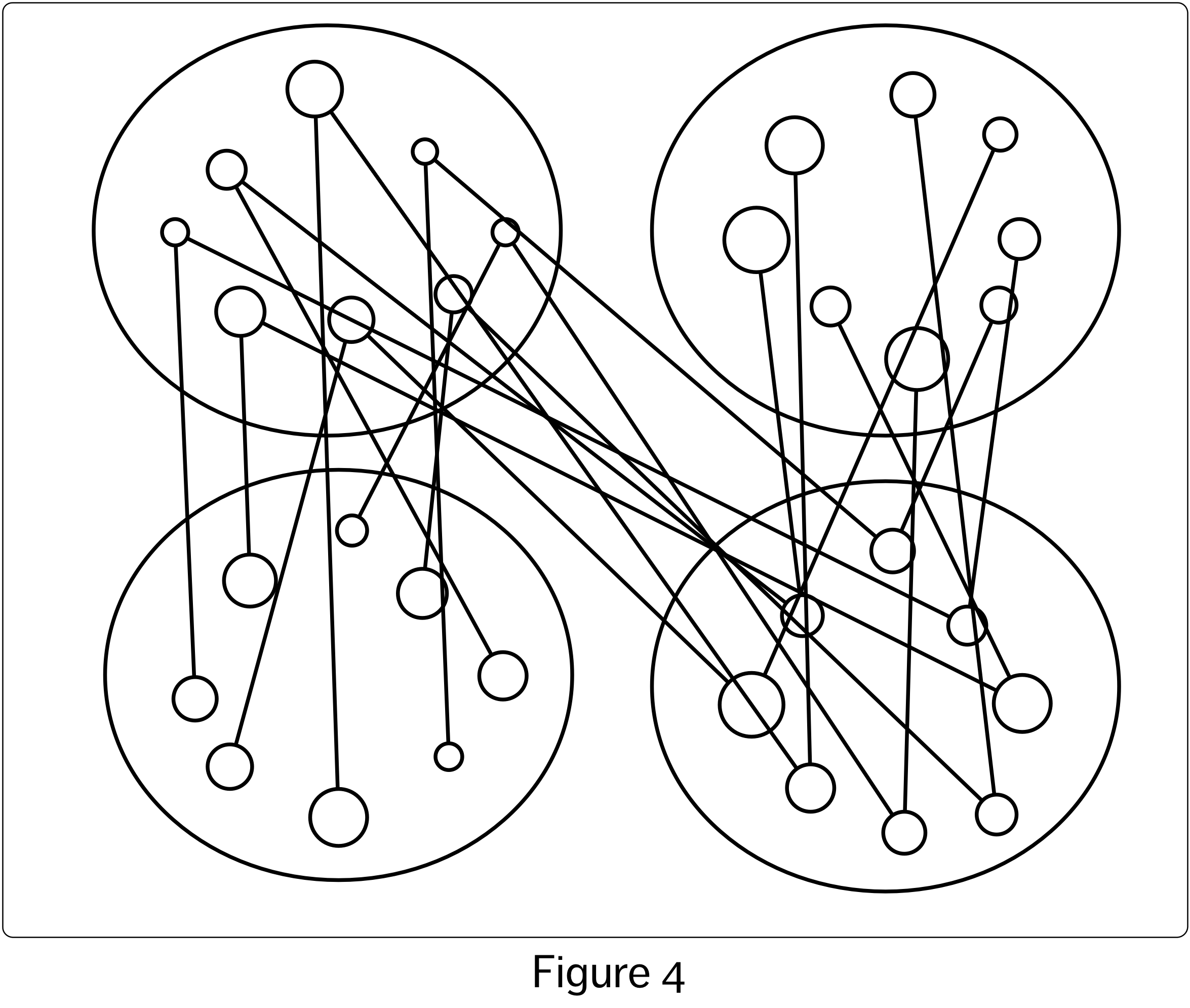
None of the visualizations that I have shown to this point have represented any of the specific relationships between the values of the different variables (e.g. visualizing the relationship between two of the four variables so as to make visible whether or not when the values of one variable increase, the values of a second decrease). They have only visually shown which data are associated with which variables and datapoints, along with visually representing their values. Even in the mess that is Figure 4, we can technically determine which data values belong to the same datapoint, since they are joined by lines, and slightly more easily determine which data belongs to which variable based on the locations of their respective circles. In theory, with this information in mind, we could try to extract some sort of additional, more specific relationship between the variables represented, for example, by two of the large ovals. We might try to do this by looking at each of the circles that are joined by lines across these two ovals, and then trying to extract information about the variable-variable relationship from this inspection, but this is an almost futile task. It is very hard to derive any sort of ‘second level’ relationships between specific variables from this visualization of the more fundamental dataset relationships. This difficulty remains even for the more compact visualizations in earlier figures.
It is not surprising that traditionally, rather than representing each data value by its own visual object, we instead represent each datapoint – which is a collection of values – as a single object, with each value in the datapoint represented by a property of that object. By using this strategy, we remove the need to represent the underlying datapoint relationship explicitly. As a result, the representation becomes much more cognitively compact, usefully piggy backing as it does on our existing visual capabilities. This also gives us more leeway to deal with categorical variables using the more explicit strategy for visualizing relationships – i.e. by using connecting lines or spatial arrangements to denote the relationship.
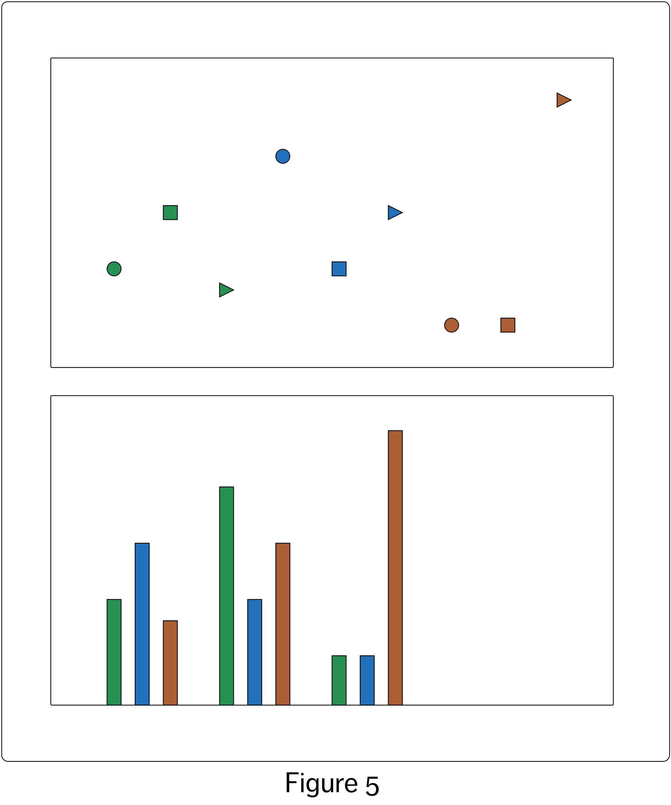
Figure 4 painfully shows us that if this more explicit approach isn’t used sparingly it can turn into a visual nightmare. However, in the two visualizations in Figure 5 we can see that the explicit approach can be quite effective when used judiciously. The relationships between two categorical variables and one numeric variable could be represented as shown in the top visualization in Figure 5. However, using spacing of the visual objects to show one category membership, as in the bottom visualization of Figure 5, frees us to use colour to indicate the other categorical relationship. The value of the third variable is shown by the height of the bar. Note that I did not need to use a full bar to visualize the numeric value, but perceptually this helps us to compare the values.
 By combining implicit and explicit approaches to visualizing relationships it could be possible, in principle, to visualize an infinite number of relationships between variables, assuming we had an infinitely large visualization space. We could even imagine automating the creation of such visualizations simply by devising a strategy for randomly mapping data variables on to visual variables, in a way that would respect the different types of variables involved in the mapping (e.g numeric-numeric, categorical-numeric).
We can also imagine a vast catalogue showing every visualization option for each number and combination of variable types: numeric-numeric, numeric-categorical_unordered…, numeric-numeric-numeric, numeric-numeric-categorical_unordered… and so on. On the one hand, this approach seems nicely methodical. It provides a strategy for creating large numbers of visualizations of a dataset ‘from the bottom up’: simply start with single variable relationships, visualize all of those using all possible visualization strategies available for single variable relationships, then move on to two variable relationships, and so on.
The problem is that for even a modest-sized dataset, there are a very large number of possible visualizations that can be created in this manner. How do we wade through this vast number of possibilities and choose the visualizations that are the most perceptually and aesthetically effective? We do have some sense of what we are aiming for, at least: On the perceptual front, the goal would seem to be to optimize the use of our visual system’s capabilities to perceive the most important patterns and structures. And I could speculate that, aesthetically, the goal is to influence people’s willingness to engage with the visualization by presenting them with an aesthetically pleasing experience.
For now, I end by providing some practical suggestions for building data visualizations from the bottom up:
- For any given dataset, when it comes to visualization we will always have many many possible relationships to chose from and to visualize, simply due to the nature of datasets. The more variables and data points there are, the more relationships we have available. By being aware of the existence of these many relationships, in all their combinations, as well as all of the possible mappings onto the visual variables, we can appreciate all of our data visualization options.
- If we visualize multiple relationships within the same visual object, by assigning datapoint variables to the visual object variables, we will have an easier time processing and understanding the visualized relationships. However, if we need to, we can also show these relationships using connecting lines and spatial arrangements.
- In principle we can visualize large numbers of these relationships at the same time, assuming we have a large enough canvas, although in practice we must be selective about the ones we choose to showcase, so we can adequately process the relationships with our visual systems.
- In the data exploration phase, we can start out by visualizing many of these relationships, in many combinations, using methodical strategies and/or random strategies, supported by our knowledge of all of the different mapping options for variable types. We will be more effective here if we understand the general concepts behind mapping datasets to visual variables, which I’ve been discussing in these blog articles. These can help us to carry out our explorations in a way that is both methodical and creative, and through this gain stronger sense of the structure of the dataset as a whole.