
This is the second in a series of articles where I take a philosophical approach to thinking about data visualizations, and try to develop my own framework to describe the underlying structure of data visualizations. If you enjoy philosophical-type discussions, I recommend that you start with the first article, here, where I talk about visualization for data exploration vs data communication. In this second article I get more into the nitty-gritty details of my possible data visualization framework by thinking in some detail about how we map structures in a data set onto visual elements in a data visualization. In subsequent articles I talk about how understanding the relationship between the data itself and the visual representation of that data can allow us to experiment with many different visualization options, and possibly even automate the construction of data visualizations, in a limited sense.
As I mentioned in my last blog article, creating a data visualization involves mapping variables in a dataset onto visual elements in the data visualization. The structural similarities between the dataset and the visual elements let us ‘look through’ the visualization to perceive the data structure. For example, we might map one numeric value onto the x axis of a scatterplot and another numeric value onto the y axis of a scatterplot. This mapping lets us see the relationship between the values in each of the data variables – we can see that as variable 1 values increase, variable 2 values decrease. To construct the mapping, we take advantage of the properties of the visual elements themselves – e.g. size, shape, colour, etc.
In this follow-up article, I take a closer look at what visual properties are available to us, and by extension what options are available to data visualizers when they need to make this mapping between the data properties and these visual properties. I’ll also provide one or two example visualizations that break away from some of the more common mappings in order to show that there’s a very rich playing field available to those creating data visualizations.
Types of Variables
While their labels may vary from data scientist to data scientist, generally speaking it’s recognized that there are certain types of variables in a dataset. For the purpose of this discussion, we can consider the following types of variables:
- Continuous Numeric Variables
- Discrete Numeric Variables
- Categorical Variables, Unordered
- Categorical Variables, Ordered
In addition to these four categories, we can also more broadly distinguish between continuous and discrete variables – with a continuous variable being a measure of any property that has no inherent ‘gaps’, and a discrete variable being the measure of a property that ‘chunks together’ into specific discrete elements, with the variable values also being distinct and countable. And we can contrast ordered with unordered variables. Numbers are ordered by their nature, but in the case of categorical variables, the ordering doesn’t come ‘for free’. If we wish to, however, we can assign the values of categorical variable an ordering – e.g. the months of the year have an obvious ordering because of their underlying relationship with the passage of time and movement of the earth around the sun.
Turning away from the properties of the dataset, and towards the properties of the visualization, we can ask what properties the visualization medium has in and of itself. These properties can be represented or measured by what I will refer to as visual variables. This is a term originally from cartography, but I am slightly repurposing it here to discuss data visualizations more broadly.
We know that most visualizations are presented on a two dimensional surface, although it is quite possible to present three dimensional visualizations through the use of, for example, a 3D-printer. We can also create the illusion of three dimensions on a two dimensional surface, but this adds a host of perceptual complications, so for now I will focus on the properties of (effectively) two dimensional visualizations on a two dimensional surface.
Within this context, information specialists have attempted to define salient properties and variables. For instance, Bertin, in ”Semiology of Graphics” (1967) defines what he calls ‘retinal variables’: size, colour value, texture, colour hue, orientation and shape. Notice that horizontal and vertical position are not included on this list. This is a deliberate omission because Bertin wished to capture with the term ‘retinal variables’ only those variables that did not require a movement of the eyes across the page. Adding position into the list, we get what he called the visual variables. Subsequent visualization specialists further expanded upon his original list.
These variables, or attributes, were originally intended to speak to cartographers creating maps, which are not entirely the same as data visualizations. If we turn to data visualizations, specifically, we might start by broadly dividing data visualization components into the following high level categories:
- Framing elements
- Frame of Reference (e.g axes, compass rose)
- Visual Framing (e.g. grid lines)
- Background
- Labels
- Title
- Frame of Reference Labels
- Element Labels
- Legend
- Representational visual objects (e.g. point, line, circle, square)
Framing elements and labels provide necessary context and perceptual structure in a visualization, but it is the representational visual objects, and their properties, that carry, or represent, the structure of the data itself. I will be focusing on representational visual objects, or visual objects, for short, in the rest of this blog article.
If we think of a two dimensional physical object, what visual properties does it have? Bertin has already provided the critical starting point. Relevant properties include:
- Horizontal position
- Vertical position
- Shape (Bounded Area):
- Number of sides
- Angle of sides
- Magnitude:
- Height
- Width/Length/Diameter/Thickness
- Colour:
- Hue
- Saturation
- Light
- Orientation
- Pattern/Texture
- Proximity
- Connection
- Distance
- Angle
Do these properties apply to all visual objects? While, in the abstract, points are one dimensional and lines are two dimensional, in practice, lines and points in a data visualization are necessarily two dimensional shapes (or three dimensional, strictly speaking, e.g. if the visualization is drawn or printed). Even so, it’s still useful to make a distinction between visual elements that are intended to represent points and lines, and and visual elements that are intended to represent a two dimensional shape. Fortunately, this distinction is still manageable using the listed properties. A point would be described as having number of sides 0 and angle of sides 0. A line would be described as having number of sides 1 and angle of sides 0. At the same time, other properties (e.g. magnitude, colour) might also still be provided for such an object, recognizing that these points must be represented in a two dimensional medium.
The proximity visual variable is unique on this list of variables in that it involves both the object in question and also necessarily one or more other objects. From a visual perspective, we can perceive when an object is touching or overlapping another object or objects. In addition, the gestalt behaviors of our visual system may cause us to perceive multiple objects that are in close physical proximity as either a connected grouping of objects or as a single object. And even if the objects in question are not touching each other or visually grouped, we will still perceive more general spatial relationship between visual objects, which can be described in terms of continuous spatial properties (e.g. distance, angle).
Each representational visual object can thus be described by assigning a set of values to each item in this list of visual object properties. Consider, for example, the following values:
- Horizontal position: 20
- Vertical position: 30
- Dimensionality + Shape:
- Number of sides: 4
- Angle of sides: [90, 90, 90, 90]
- Magnitude:
- Height: 10
- Width/Length/Diameter: 5
- Colour:
- Hue: 220
- Saturation: 30
- Light: 60
- Orientation: 45
- Pattern/Texture: hash
- Proximity: None
This represents a single small blue rectangle, filled in with a hash pattern, positioned slightly more vertically than horizontally and rotated at 45 degrees, relative to the reference axes of the visualization.
Mapping Data Onto Visual Objects
This takes care of the visual object by itself. But how does a mapping work between the visual properties of this object and the values and relationships – i.e. the structure – of a dataset? First, notice that many of these visual properties are continuous and, as such, can be used to represent continuous variables. For example, a single data value of a continuous variable might be mapped on to the angle of a single short line, or onto the horizontal position of a point. Values of categorical variables can be represented by discrete visual variables – for example, each month might be represented by a shape with a different number of sides. Alternatively, categorial variable values can be represented by taking a continuous property, and choosing specific different values (or ranges of values) of this property to represent each of the different categories of the variable. For example, we might choosing a specific red to represent one category, and a specific blue to represent another.
One of the great strengths of data visualizations is that they can readily show the relationship between the values of multiple variables. This is accomplished by assigning each data variable to a different visual variable. As the values of each variable change, the visual representation changes accordingly. And because all of the chosen data variables are typically represented within the same visual object, our visual systems can process the relationship using the gestalt capabilities inherent in the operating of our visual system. Since, excluding proximity, there are 11 visual variables, in principle it is possible, simply by altering the values of these variables, to show the relationships between 11 data variables, so long as 2 of them are categorical (if not, there are 9 mappings). Even more relationships could be shown if shapes composed of, or connected by, additional shapes were added to this mix. Realistically, however, our visual systems will have increasing difficulty processing these relationships as the number increases.
If we are dealing with fewer data variables than visual variables, we may assign constant values to those visual variables that are not used (e.g. make all shapes the same colour if colour is not being used to represent a variable). An extension of this strategy is to choose a value for the unmapped visual variable that makes this variable less perceptually salient – for example, by making the colour of the shapes the same as the background colour, we are essentially making the colour a non-variable, from a representational perspective. Similarly, if we are using circles as our visual objects, and we reduce the diameter to very close to zero, while still allowing the dots to be visible, the size of the dots becomes easier to ignore. A final strategy for unused variables would be to choose different values for every object but base these values on perceptual rather than structural considerations. This strategy is often used, for example, when creating graph (network) visualizations. The position of the dots relative to each other does not carry relevant information about the structure of the underlying dataset, so it can be chosen instead based on ease of information extraction and other perceptual considerations.
Proximity
The proximity variable deserves some further consideration, with respect to how it represents relationships between two or more data variables, as well as relationships in the dataset more generally. We have already discussed implicitly representing relationships between two or more data variables by combining different visual properties of the same object – e.g. size and colour. In such a case, we naturally assume that there is a relationship between the values because they are combined in the same object. However, in the case of the proximity variable, relationships can represented more explicitly, either as their own objects (e.g. lines) or as a spatial relationship between objects (e.g. distance).
The proximity property is unique in that it has, effectively, a discrete, mode and a continuous mode. In the case of categorical variables, or any variables with discrete values, we can represent the relationship between the variable values as its own visual object, or set of objects, with their own specified properties. For example, we might use a set of lines to connect a series of point objects, indicating that all of these objects are related to a particular value of a categorical variable. And we might then connect the values in another category using lines with different visual properties. This is a commonly used strategy when creating line graphs. Alternatively, we might place all of the visual objects connected to a particular value of a categorical variable in their own square, using different squares for each value of the variable.
In the case of relationships whose relevant properties go beyond just existence (e.g. I am related to you), and have specific values associated with the relationship as well (e.g. age difference between two people), we might use the spatial relationships between two visual objects (or their central points, if they are shapes) to represent the relationship between two data variables. We might use, for example, the distance between shapes to represent the age difference. Alternatively we could use the size of the angle between the objects to represent the relationship. That said, it should be noted that, if two variables have already been mapped on to the horizontal and vertical elements of the data visualization objects, then spatial properties such as distance won’t act as a separate variable. Consequently it will most likely be difficult to set them up in the visualization such that they are consistent both with the variable of interest and with the already existing spatial relationships generated by the horizontal and vertical values. An exception to this could be if the relationship of interest itself is mappable onto Euclidean distance, relative to the variables being represented horizontally and vertically.
Tables
A table is another interesting example of using spatial relationships to indicate data relationships. Although we might not typically think of it in this light, a table is at least partially a visualization, because it uses the position of the variable values in the table to indicate which values are connected to a particular data point (by virtue of the values sharing the same row), and also to a particular variable (by virtue of the values sharing the same column). These spatial relationships – and by extension data relationships – are typically made even more obvious by adding framing grid lines or colors to the table visualization. Here, we can think of the specific data point labels and the specific variable labels themselves as values of two more fundamental categorical variables – data point and variable – with every individual value in a dataset describable as being in relationships with the other dataset values based on the value of these variables. Additional relationships between variables are derived from these more fundamental relationships. This discrete, finite set of relationships makes datasets importantly different from what might be called a more pure, abstract, or all encompassing description of a relationship between variables, which could, for example, take the form of a mathematical function.
If you have duplicate datapoints in your dataset, then these may end up being represented by a single visual object in the data visualization. For example, if you have a dataset with two variables, which you are visualizing using a scatterplot, then datapoints with the same values in these variables will end up on top of each other and will not be visibly distinguishable. This may or may not be an issue, depending on the goal of the visualization.
Adding information to the dataset in the form of new variables or new relationships between values can serve to distinguish these otherwise identical points. For example, if two datapoints with identical values are each in different relationships with other datapoints or values, and these relationships are also being visualized, then, even given their identical values, these datapoints will become distinguishable, as they are no longer truly identical. For example, if we consider a single numeric variable with values visualized on a number line, it would seem that identical values would not be distinguishable. However, if some of these values have relationships with each other, and these relationships are indicated by lines connecting the dots, the multiple lines coming from locations where dots are stacked on top of each other could serve to indicate the multiple visual objects super-imposed upon each other. Jitter is a pragmatic solution to this issue, as well, with small amounts of noise added to the horizontal and/or vertical variable values in order to prevent a complete overlapping of objects.
Unconventional Mappings
Data visualization practice has a number of traditional ‘go to’ strategies for setting up the mappings between data and visual variables, as well as the framing for these mappings. The result is the common stable of workhorse visualizations we are so familiar with. For example, when presented with two continuous variables, the default strategy is to visualize the relationship by mapping these onto the horizontal and vertical positions on the page, choosing points as the shape, and framing these visual objects using two axes lines, labelled with information showing the relationship between the horizontal and vertical space and the values of each variable.
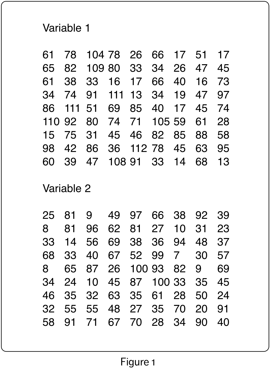
However, there are many other options for representing two continuous variables. For example, using the data show in Figure 1, one numeric variable could be represented by the diameter of a circle, and the other numeric variable could be represented by the shade of the circle.
To map the variables we carry out a transformation of the data variable values, mapping them on to the visual variable values. The resulting shapes are framed in a grid. This visualization, shown in Figure 2, is quite distinct from the traditional scatterplot, but represents the same information.
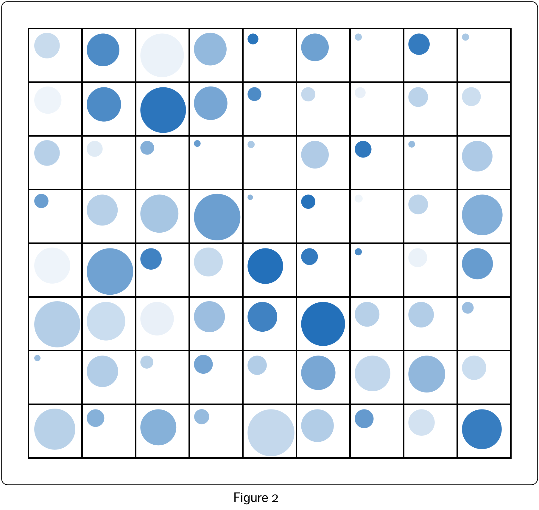
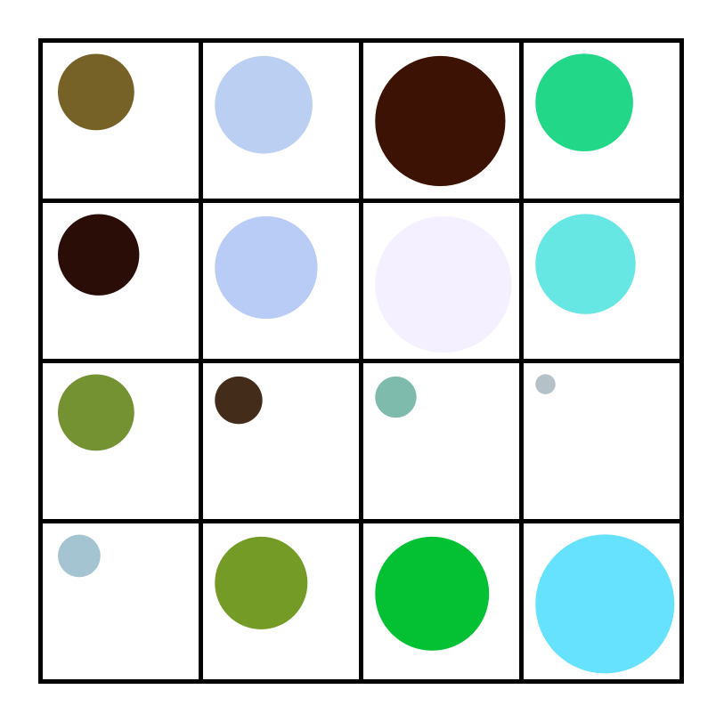
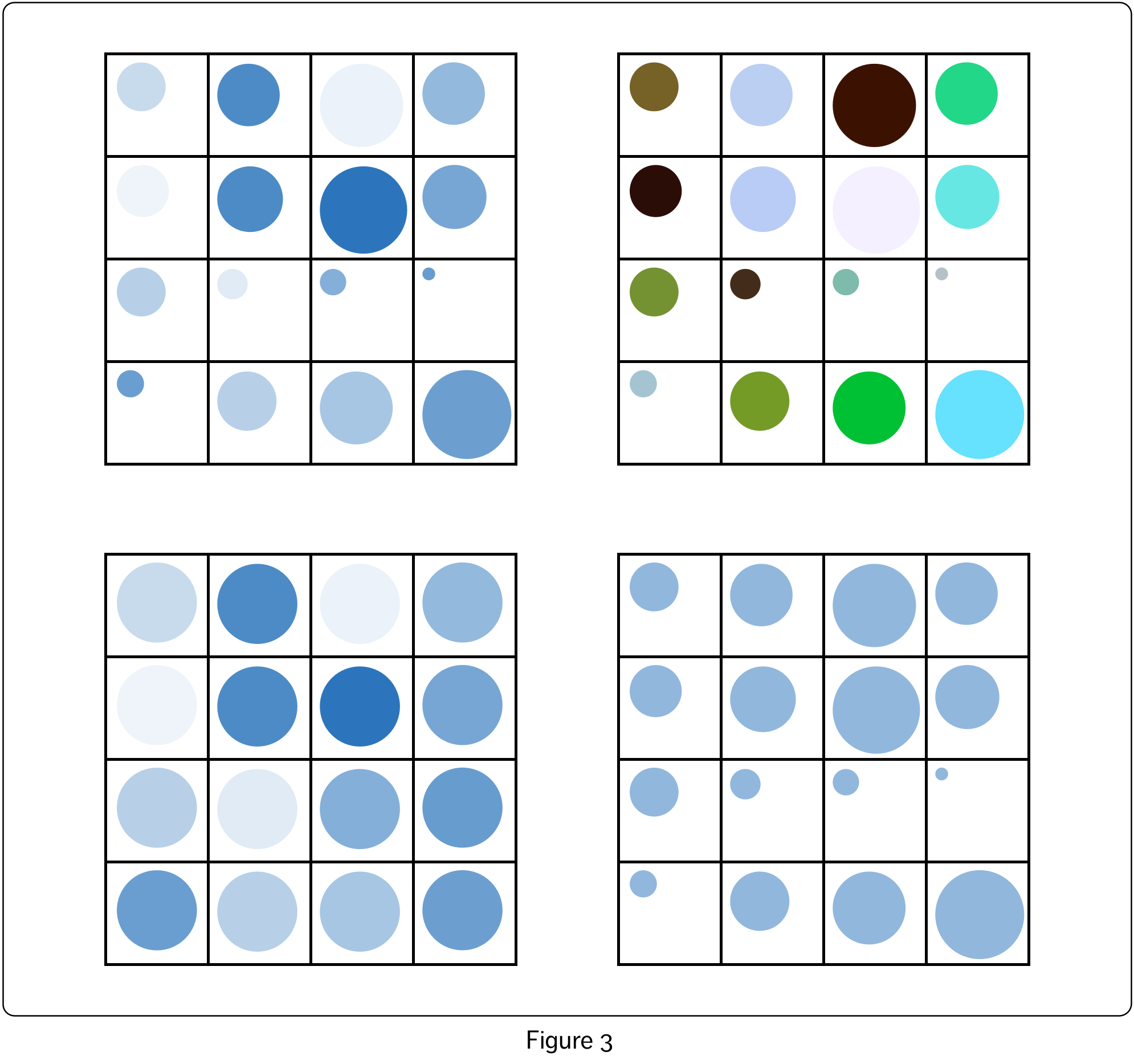
Figure 3 shows some variations created by visualizing a smaller portion of the dataset (from Figure 2, the first four rows and columns of the grid). The top left shows the original representation from Figure 2. On the top right, four, rather than two, visual variables have been recruited – circle diameter, colour hue, colour saturation and colour lightness. Here, circle diameter and colour saturation both represent the values of the first variable, and colour hue and lightness both represent the values of the second variable. The bottom two visualizations show only the values of the first and second variables respectively, with other visual variables held constant.
By breaking down the nature of the mappings between dataset variables on the one hand, and visual variables on the other, I hope to encourage experimentation with the way that these variables are mapped and combined. This framework should also make it easier to automate the generation of visualizations, and allow for the generation of novel visualizations by, for example, randomly generating mappings between these two types of variables. However, that will be a topic for another blog article.
2 Replies to “Data Visualization: Mapping Data Properties to Visual Properties”
Comments are closed.