
This is one in a series of articles where I take a philosophical approach to thinking about data visualizations, and try to develop my own framework to describe the underlying structure of data visualizations. I recommend that you start with the first article, here, where I talk about visualization for data exploration vs data communication. In my second and third articles I get more into the nitty-gritty details of my possible data visualization framework. In this fourth article I talk about a particular aspect of data visualization, the frame of the visualization.
In a previous article on mapping data structures to visual structures, I said that a data visualization consists of:
- Framing Elements
- Labels
- Representational Visual Objects
Then, in a follow-up article on creating visualizations from the bottom up, I suggested that, as a useful thought exercise, the reader might imagine how they could create a strategy for automating the generation of all possible data visualizations for a particular dataset. For that particular exercise, the focus was on the visual objects themselves. However, assuming the goal of a fully automated data visualizer, a major gap there was a lack of discussion about how appropriate framing elements and labels for the visualization could be chosen in this automated context.
In this article, I try to close that gap by discussing framing elements and labels in more detail, with a focus on how they relate to the choice of visual objects and the mappings between visual variables and the dataset variables. Framing elements include axes, grid lines and other visual elements that do not directly represent aspects of the data values, but which provide, by their presence, structural and perceptual support for interpreting the visual objects that do directly represent the data. Labels make explicit the precise mapping between specific data values and specific visual object properties.
I should remind myself, up front, that the goal of this thought experiment is not to devise strategies for creating the most perceptually salient and aesthetically appealing visualizations. Rather, it simply to devise strategies that allow us to automate the basic creation of any type of visualization. Even this is no small task. A quick look at just a small number of the many different types of visualizations that have been created will reinforce the sense that devising a strategy that can, in theory, generate all of these types of visualizations on some automatic basis is probably a tremendously difficult task.
That said, if we think about all of those visualizations, we can start to see a common theme with respect to the framing elements. All types of framing involve carving the canvas into sub-regions, which then relate to the data values in specific ways. Most obviously, and a bit prosaically, the frame elements first divide the canvas into the part where the data is represented and the part which is outside of the representation. This outside part may still have content – for example a title or a legend – but data is being represented only within the frame.
The unlabelled line is perhaps the simplest framing element. Starting with a straight line, or, structurally equivalently, a circle (more on this shortly), by adding representational visual objects, such as lines or dots, to this line, the frame is broken into sub-regions. Typically, single lines are used when we are representing value-value relationships within a single variable, rather than visualizing relationships across variables. The line allows us to more easily visualize and understand these data value relationships in a one dimensional fashion. The mapping of numeric values seems straightforward, since the property of magnitude maps easily onto spatial distance, and the implicit ordering of the values are captured by the ordering on the canvas. Lines can also be used with categorical variables by mapping particular points or regions on the line to the values of the variable. In this case these points or regions indicate the part of the space on the canvas that is ‘reserved’ for a particular value of the variable.
In visualizing these relationships (e.g. difference in magnitude, order of values), the line itself is not entirely necessary. From a strictly structural point of view, we could simply position the points themselves in a lined up fashion on the page, without adding in the line. At minimum, however, adding the line helps us ignore the extraneous second dimension, and focus instead on the size of the gaps between the points, which represent differences between the values, as well as on the ordering of the points on the line, which represents the ordering of the values.
This strategy also tacitly assumes that we have generated a mapping between the space on the page and the values in the data: for example, a distance of 1 cm on the page could represent 223 units of the value in question. When labels are added to the number line, it gives us precise information about this mapping, and allows us to extract the original data values from the line. A labelled axis can do more than this, however, because constructing the element in this way also lets us represent values that could be present in the variable, in theory, but are not present in practice. For instance, if our variable is an integer value variable, it could, in theory, contain the value 5. Reflecting this, we can have a position on the line that represents the value 5, even if the value of 5 never shows up in this particular dataset. This is relevant when we talk about variable relationships and mathematical functions, which will crop up again in future discussion.
If we use the base strategy of a single line to represent all of the values of each variable, in relation to the other values in that variable, and then place all of these lines in parallel, on top of another framing line, and use labels to indicate which line maps on to which variable, we end up with something called a parallel coordinates chart, as shown in the top right of Figure 1. This uses the strategy of explicitly depicting relationships between individual values in different variables by drawing lines between the related values. Because the visualization is relatively well organized spatially, the situation does not get quite as messy as might otherwise be expected (see Figure 4 in a previous article to see a messy alternative).
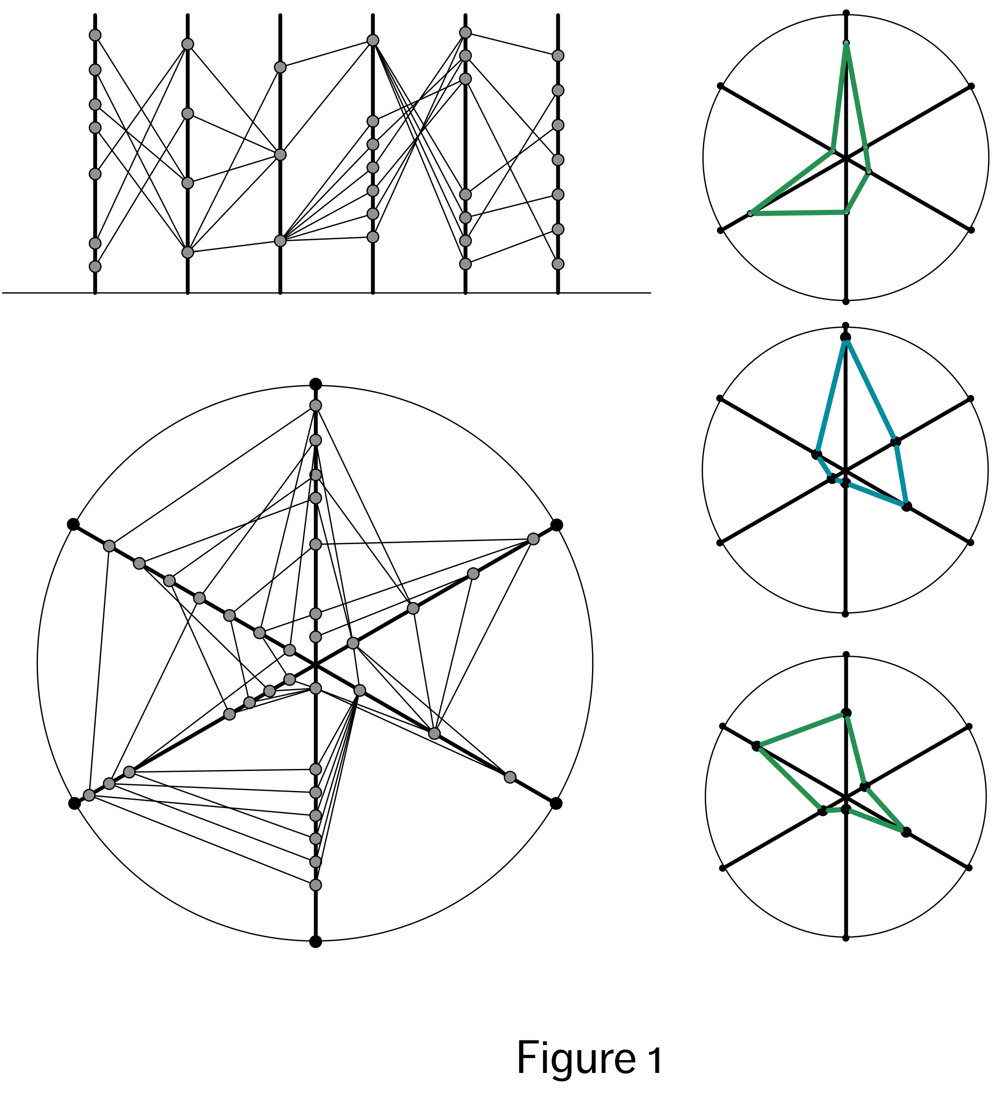
In some respects, the parallel coordinate visualization is quite amazing, in that it allows us to visualize all of values of all of the datapoints in a dataset, and also a hypothetically infinite number of variables (assuming an infinite canvas). True, it only directly lets us see two relationship pairings for each variables (i.e. we can directly compare the values of variable 2 with variable 1 and variable 3, but not directly compare the values of variable 1 and 3 unless we make a second visualization), but the fact that it can show even this for so many variables is impressive. Unfortunately, from a perceptual and aesthetic perspective, the parallel coordinate visualization is lacking. From an aesthetic point of view, it looks messy and uninspiring, and from a perceptual point of view, it neither highlights any particular relationship in the dataset, nor makes it easy to synthesize multiple relationships into a whole that is greater than the sum of their parts.
The radar, or spider chart, shown in the bottom left of Figure 1, is an improvement, in this regard. Relating this back to our discussion of circles being structurally equivalent to lines, the spider diagram here is created simply by turning the bottom line of the parallel coordinates visualization into a circle. By doing this, and having the axes lines radiate out from a central point, we can create closed shapes from the lines that join points on these axes. Visually this lets us compare shapes with other shapes, rather than lines with lines. As a consequence of this, the spider chart may faciliate, the extraction of a different sort of information than the parallel coordinates visualization does. Specifically, by turning the lines into a closed shapes (see right column of Figure 1), and then comparing the shapes themselves, as a whole, we have a more gestalt experience of the relationships across all variables, which arguably gives us more information than the individual relationships.
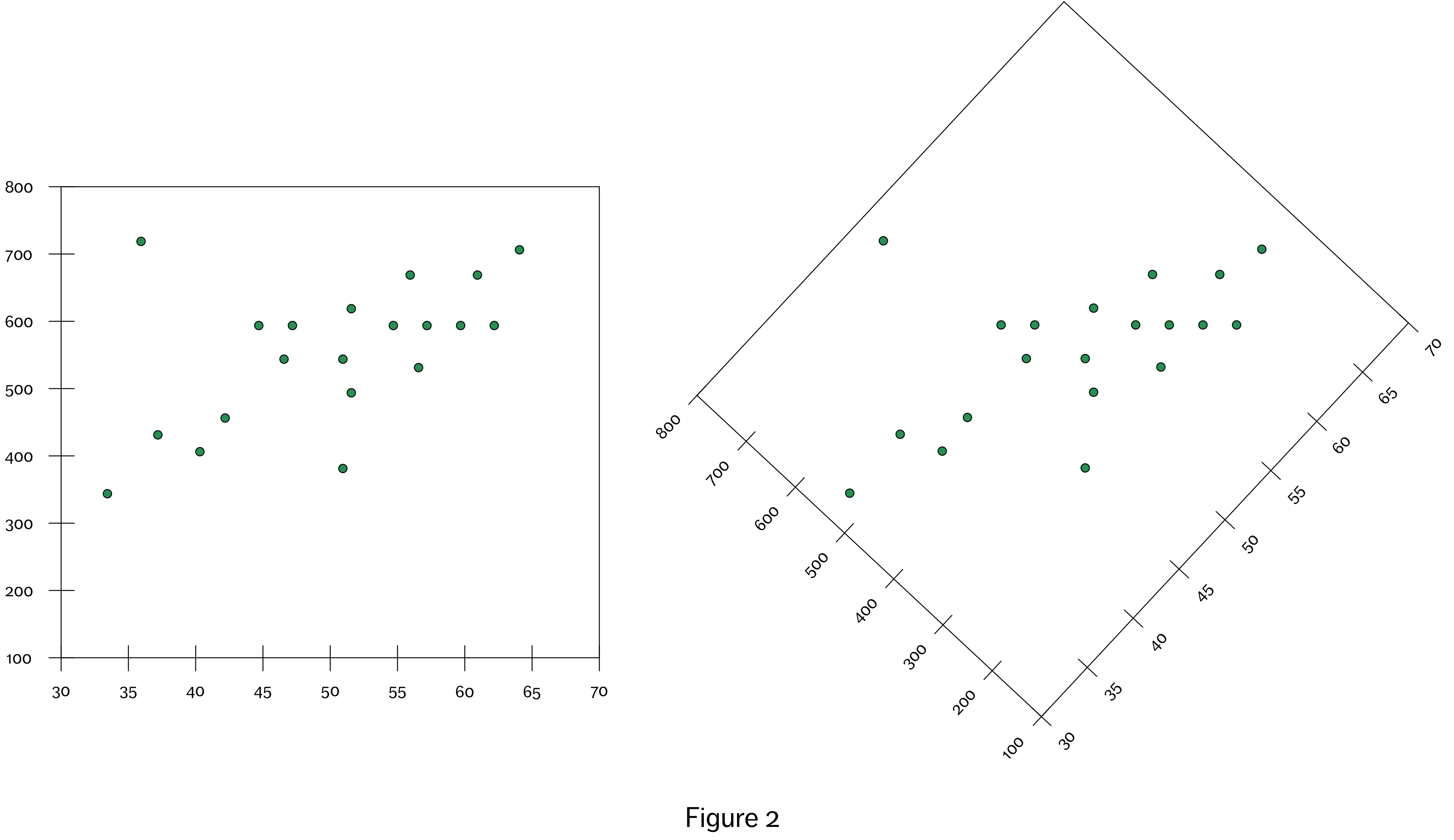
In cases where we are focusing more closely on the relationships between only two variables, we can take advantage of the horizontal and vertical properties of the canvas. Here again, the framing becomes important. In this case, we need two lines to give us the appropriate frame of reference to extract the relevant data values. Different points of origin will result in different horizontal and vertical measurements (see Figure 2), so here the framing lines are more than just a visual aid. The point of origin can’t be left up to the imagination of the viewer; rather, we need the labelled axes in order to extract horizontal and vertical position information about objects that correctly maps on to the data being represented.
We might also represent a relationship between two values of a single variable (e.g. the difference between these two values) by mapping this relationship onto the angle between two objects. In this case, to determine the angle between two visual objects, we only require a point of origin. Here the frame of reference might consist of a single dot. However, again, in such a case we will likely want to provide additional framing and labelling – a circle with tic marks, centered on the origin, for example, or two axes – in order to allow the viewer to effectively ‘look through’ the visualization to extract the data values themselves.
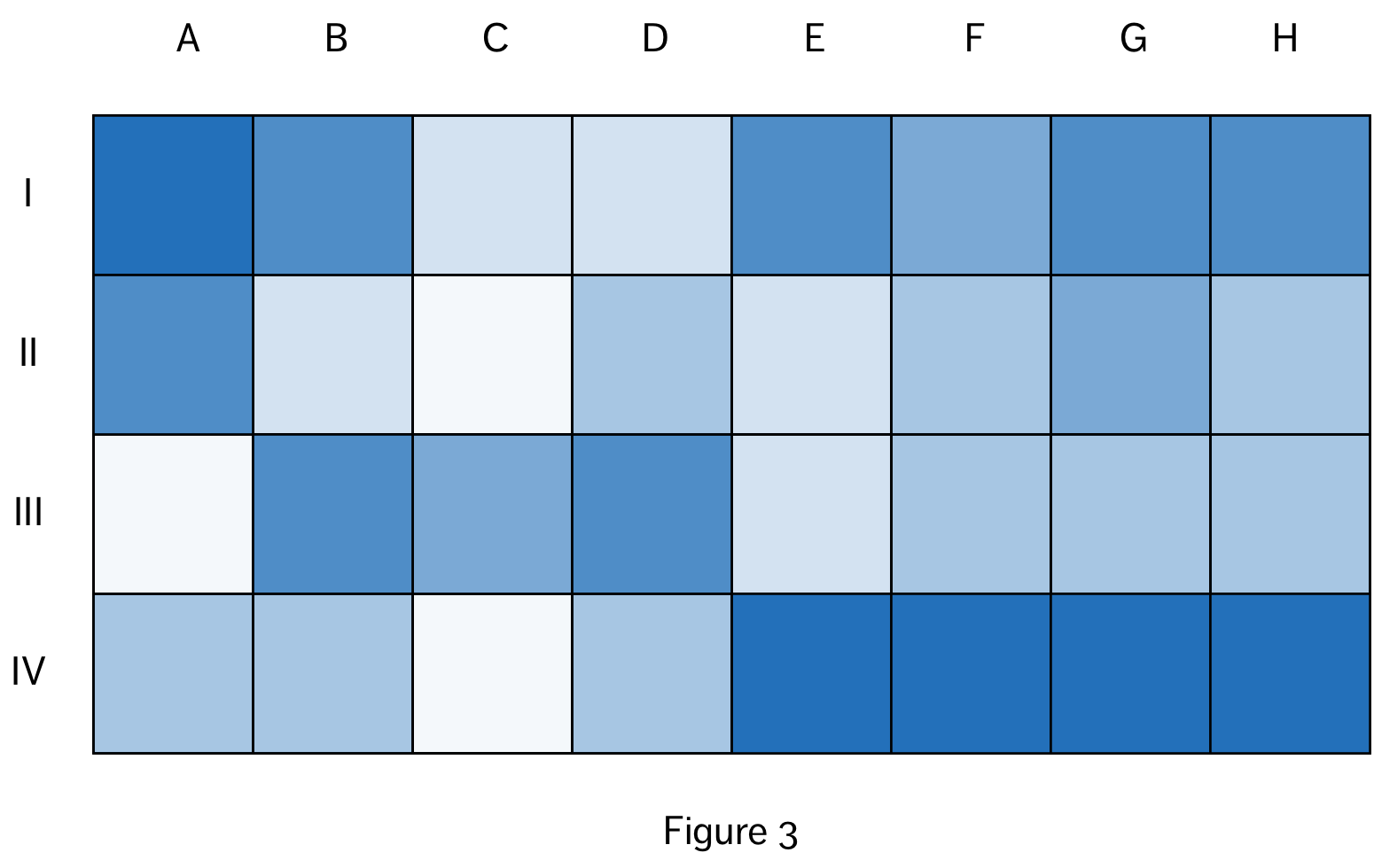
A third framing option, the grid, is the logical extension of the horizontal and vertical axis framing strategy. A grid consists of lines that block-off sections of an x and y axis, and reserve them for particular variable values (e.g. values of a categorical variable). We see this most obviously in the table format, which reserves horizontal space for the values of each datapoint and and vertical space for the values of each variable. We also see this in the heat map (see Figure 3), which reserves horizontal space for each value of one categorical (or discrete) value, vertical space for each value of a second categorical (or discrete) variable and the intersecting space (grid cells) for the values of a third variable (categorical or numeric).
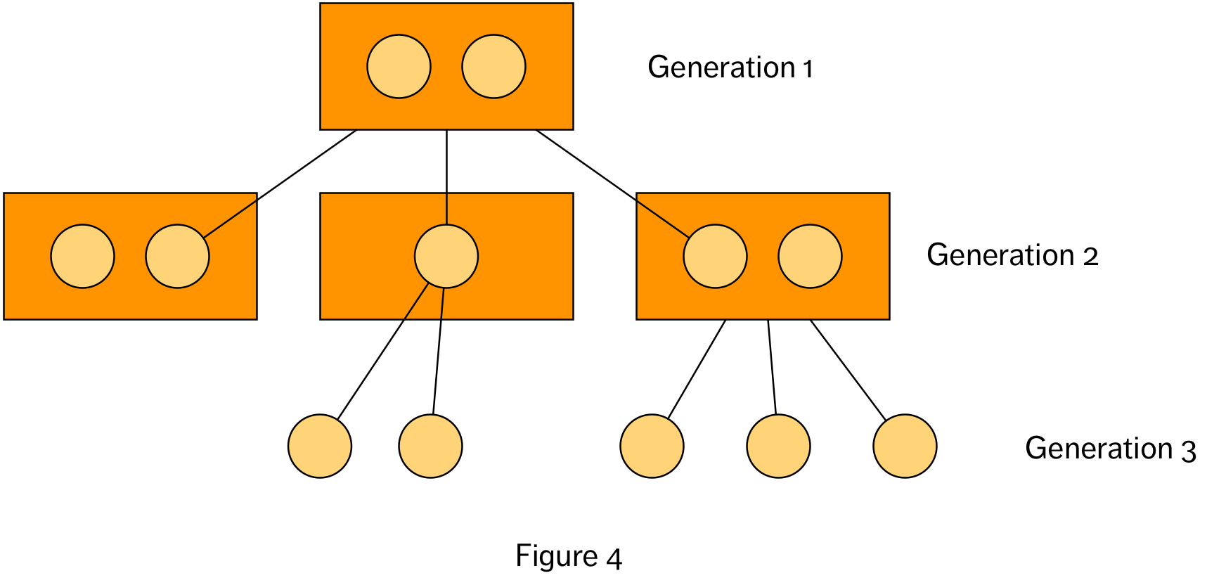
The final option is to dispense with the framing all together. We see this in, for example, network diagrams, or graphs (in the graph theory sense), which includes representations of hierarchies of relationships (e.g. a family tree, shown abstractly in Figure 4). This approach is an option when the data visualization does not strictly need a frame of reference in order to represent the data – its values and relationships. However, even when framing is not strictly necessary from a structural point of view, it may be highly beneficial from a perceptual point of view, along with judicious choices concerning where objects should be placed on the page.
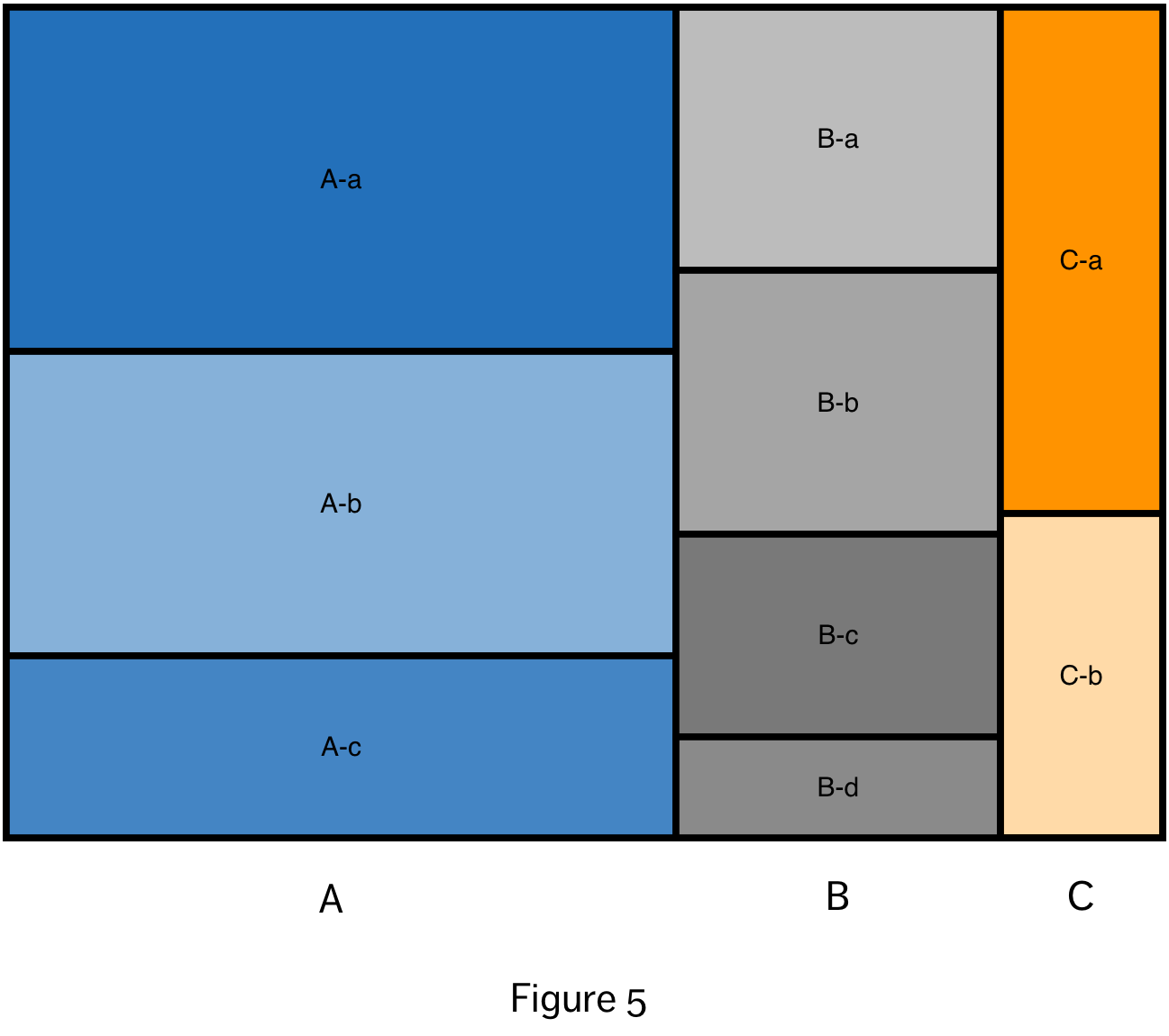
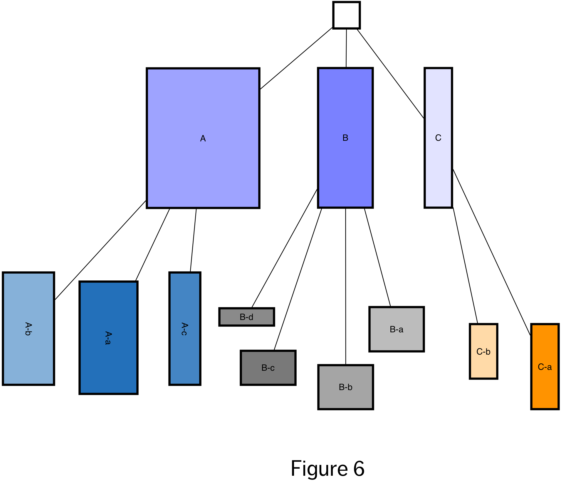
The treemap (Figure 5) is an interesting example of a data visualization that is arguably frame free, but where the spatial organization of the visual objects effectively generates a frame. It represents the relationship between a hierarchy of categorical variables and a numeric variable. The numeric value must represent a quantity that is divided up between the categories and subcategories, such that the top level category will have 100% of the value, and the summed values across each subcategory level will also equal 100%. The main frame of the visualization is first divided into rectangles proportionate to the percentage of the value within each of the first level subcategories. This is then repeated for the values in subsequent subcategories. Breaking the squares out into a tree diagram (Figure 6) makes us appreciate how compact the treemap visualization really is.
At this point in our thought exercise, while we have not yet reached the idealized objective of automatically generating every conceivable visualization from a given dataset, we are approaching a point where at least, more prosaically, we could construct a decision tree that captures some heuristics about data visualizations, and which would allow us to automatically generate at least a variety of visualizations from the dataset, along with the appropriate framing and labels. In such a decision tree, we could choose the framing elements based on the number and type of variables involved, with a random selection if multiple options were available for a particular combination. Some of the possible visualizations would only take into account a subset of the variables – for example, we could create scatter plots for each combination of the two variables – while others, like the parallel coordinates visualization could include all of the datapoints.
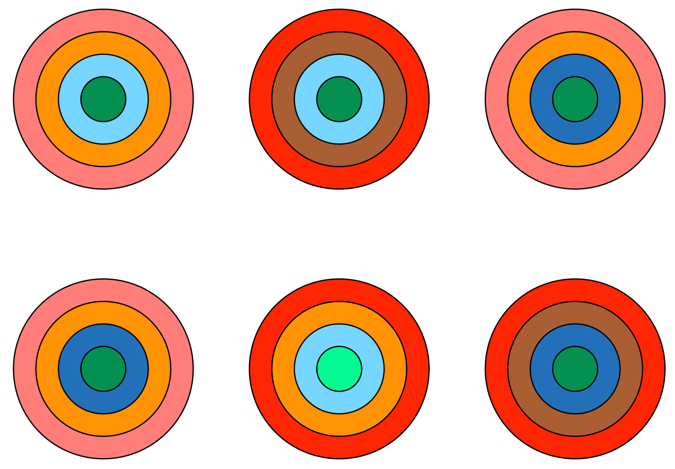
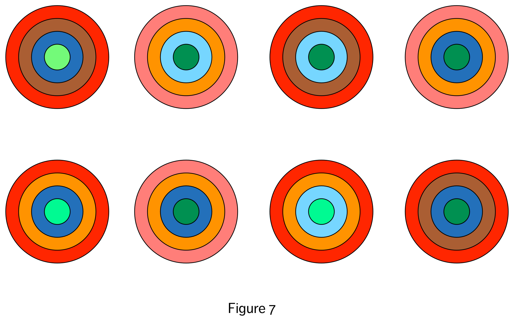
Returning to this idea of ‘whole dataset’ visualizations, are there any other strategies for visualizing the entire dataset in one go, as the parallel coordinates visualization does? Here is an admittedly odd suggestion on that front: Consider representing each datapoint as a circular object (i.e. 50 data points results in 50 circles), but instead of a simple circle, each object is composed of rings (see Figure 7). Each of the rings represents one of the variables in the datapoint, and the colour (or shade) of the ring represents the value of that particular variable. If we wanted to, we could even imagine translating this into the gustatory realm, and create datapoint gobstoppers, with the flavour nuances of each layer (how spicy, how sweet) representing a different value of the relevant variable. By eating all of the gobstoppers, we would have an experience of the entire dataset (probably along with a bad stomach-ache).
In the case of the nested circles visualization, we have a visualization that, structurally, captures all of the data in the dataset. And we could likely make it very appealing aesthetically as well. But perceptually, in terms of extracting useful information, it is probably going to be a disaster! Even worse than the parallel coordinates. Why is this? And is it really just a perceptual problem, or does it hint at something deeper, intersecting structural, perceptual and aesthetic considerations?
In a previous blog, I presented the idea that mapping variable values onto the different properties of a set of visual objects (e.g. variable 1 onto the area of the objects and variable 2 onto the colour of the objects) would let us better understand the relationship between the variables. The problem is that, in saying this, I wasn’t as precise as I could have been. In particular, I was somewhat conflating the relationship between the specific values of each variable (think the particular relationship between me and my sibling), with the relationship between the two variables as a whole (the nature of the relationship between siblings, across all siblings).
What does it mean to say that the variables as a whole have a relationship with each other, as distinct from the relationships between variable instances? It seems like there might be nothing more to the ‘higher level’ relationship than simply the relationships between the values themselves. And yet, we do often try to move beyond specific instances to make more general statements (e.g. cats have legs and a tail). From this perspective, the relationship between the variables is a generalized description of the relationships between the instances. So, for example, we might say that, generally speaking, when the values of variable 1 are small, the values of 2 are also small. And when the values of variable 1 are large, the values of variable 2 are also large.
As experiments in implicit learning in psychology show, our brains can be surprisingly good at extracting and learning the relationships between variables when presented with many examples of these variable relationships. However, we may not be able to consciously access this type of knowledge (even though we may act on it unconsciously). We can consciously perceive and describe relationships between variables, as well, but we can only internalize or intuit this explicit description of relationships up to a point, it seems. We’re generally comfortable thinking about straightforward relationships between two variables (e.g. when variable 1 is small, variable 2 is small and when variable 1 is large, variable 2 is proportionately large), but things get tricky, even with two variables, when the relationship is more complex (e.g. when variable 1 is large, variable 1 is large. As variable 1 gets smaller, variable 2 also gets smaller, but more and more slowly, relative to the change in variable 1). Throwing a third (or more) variable into the mix makes the situation even harder to grasp.
The concentric circle visualization makes it relatively easy to compare specific instances of the variable relationships in question (at least for adjacent rings of a circle) but it isn’t easy at all to generalize across all of these instances and extract the more general relationship between sets of variables. The visualization does not support this activity. The polar coordinate visualization has a bit more potential on this front. In particular, if there are relatively simple relationships across multiple variables, or even across subsets of these variables, these relationships will pop out in the visualization. The spider digram can also facilitate this visual extraction of relationships by letting us perceive different categories of shapes, that then map onto different types of relationships across variables.
Still, when it comes to visualizing the nature of the relationship between two variables, the horizontal-vertical axis frame is almost impossible to beat, due to certain quirks of our visual system. By mapping the variable values onto two dimensional space, and visualizing them as points within this frame we automatically try, first, to view the points as a single (possibly fuzzy) object, and then, second, extract the larger pattern or trend of the data by observing the positioning of this object relative to the frame of reference. This type of perceptual activity is hard-wired into our visual system, and we can typically do it with relatively little effort.
Despite the boost that this visualization strategy automatically provides, the creator of a visualization may try to assist the viewer of the visualization even further by adding a trend line to the graph. Is the trend line also a framing element? So far I have said there are only three main types of elements to any graph – framing elements, labels and visual objects – so from that perspective it must be one of these three. And yet, such lines do not seem to exactly fit into any of these categories. I would like to address this puzzling addition to our data visualization landscape here, but I have already been going on at some length about framing elements themselves, so I will leave that discussion for a future blog article.